Why you should start from UX before PLG: 5 Learnings from Folk
How to make users adopt “Aha” features fast and get +50% free-to-paid conversion.
If you’re not new to Growthmates, you already know that we sometimes share first-hand stories told by people behind great products here. Today, I’m happy to bring you the story of folk—probably the most beautiful and user-friendly CRM I’ve ever seen.
Would you like to tell your product story or share a new job opening with 4000+ subscribers from companies like Amplitude, Intercom, Miro, Atlassian, Grammarly, Framer, and more? I’m opening a calendar and planning new sponsorship engagements — grab a slot 👇
Brought to you by Command.ai — a user-focused platform offering an alternative to traditional popups or chatbots. Their AI “Copilot” answers questions, performs actions, and simplifies complex tasks. Use “Nudges” to guide users with timely, relevant messages, all within a no-code platform. Perfect for Product, Support, and Marketing teams to positively influence user behavior while respecting their needs:
Introducing Simo and Folk
Simo Lemhandez is the founder of folk, the CRM to build genuine client connections, that's simple to use and easy to integrate. folk count 200,000 users and more than 3,000 client companies today.
What we cover in this post:
Where do we start… UX or PLG?
1: How to make users adopt “Aha” features fast
2: How to help users get the right data early
3: Why invest in educational content to empower users
4: The need to empower users to adopt high-effort, yet high-stickiness features
5: Finally, how to create momentum during the first few weeks of adoption
How can you get started?
Ready to dive? Let’s dive into Simo’s story about Folk👇
Where do we start… UX or PLG?
“I do think what human are uniquely good at is creating a genuine connection with another human. Something special happens when two humans look at each other in the eyes and decide to trust each others. Decide to seal a deal. Machine will never be able to create that feeling of trust.”
Simo Lemhandez, Co-Founder at Folk
With the current state of the sales stack, that is very manual and fragmented, it takes people to do a lot of administrative, manual work to sell — limiting the time they can spend building and nurturing relationships.
We built folk to give people back their time, and let them focus on what really matters — building real relationships to close winning deals.
Product-Led Growth (PLG) is often celebrated as the ultimate strategy to scale a product business. And it can prove magical as you turn your product itself as one of the main driver of future growth. Miro, Notion or Canva are great, inspirational examples.
But before getting there, one critical insight we’ve learned at folk is that the key to successful PLG actually starts with delivering an outstanding user experience (UX) to individual users.
Before focusing on expanding to entire teams, your first priority should be to create a product that a single user loves so much that they feel compelled to share it with their colleagues. As Nikita Bier aptly put it, there are only a few reasons that might make someone likely to share your app. And that’s even more true in a business context, where the main intention would probably be to sound smart.
Your job is to make your users feel that by sharing your tool, they will sound smart to their peers/colleagues. Said differently, they need to feel they have found a way to create a step change in their productivity routine, which is why it’s crucial to design an outstanding single user experience.
1. Make users adopt “Aha” features fast
To drive early user adoption, you need to reverse-engineer the actions your best users take and guide new users toward those same “Aha!” moments. The quicker users experience value, the more likely they are to think they found a new gem, the more likely they are to boast with their colleagues about it.
At folk, we’ve optimized our onboarding going through the following steps:
Identify actions the best users are taking, that correlate with long-term retention;
Rank these actions in term of ease-of-adoption;
Design onboarding so new users adopt high-impact, low-effort features.
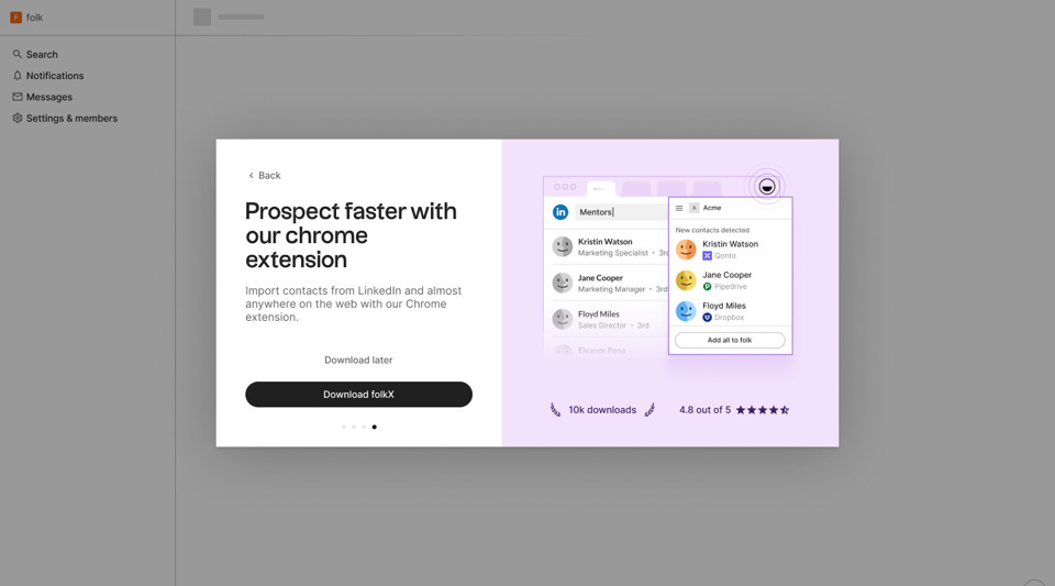
This is the reason we have been pushing the adoption of Chrome extension and email synchronization. These features are simple to set up but offer good value, making it easier for users to become advocates.
A good alternative is to look at features that correlate with high engagement. We discovered downloading the desktop app (due to the very premium real estate in our users’ dock) was a good predictor of high engagement — so we made it easier to adopt during onboarding.
Key learning 🎓
Making users go through FULL setup during the onboarding, making them go through every single action you consider necessary. They will get lost and lose motivation. Time-to-value matters a lot. Your onboarding needs to tell a story that captivate them, and bring them to this value fast.
The Impact 🚀
+50% free-to-paid conversion L12M.
+100% ACV L12M — this shows these changes contribute to closing more teams and having them longer.
2. Help users get the right data early
A great UX often comes down to helping users work with the right data from the start. One way to do this is by simplifying data migration—either through free migration services or by offering easy-to-use templates.
We have built scripts to automate migration (for free) from existing CRMs like Hubspot and Pipedrive to make it easier for our customers to get installed.
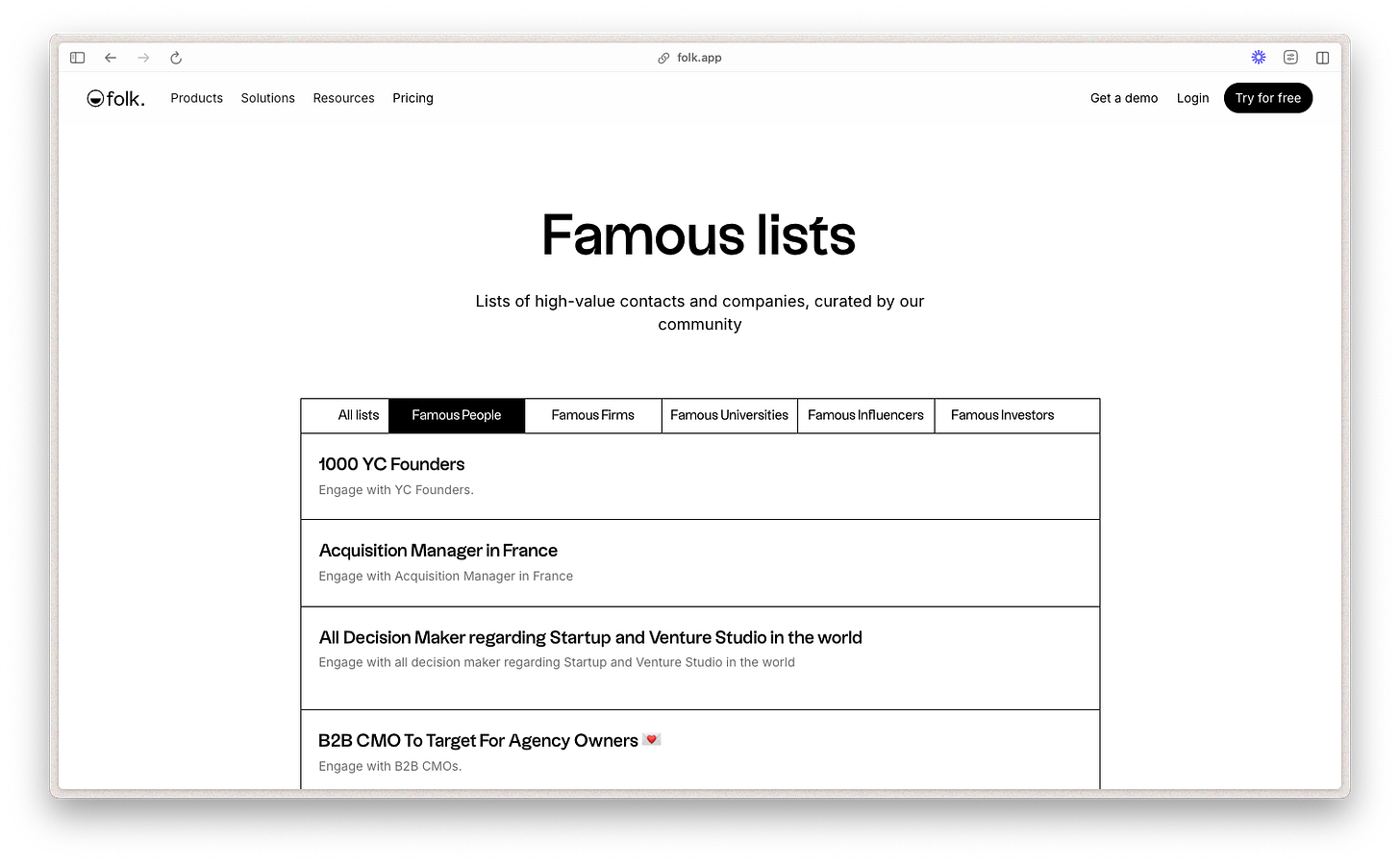
We also offer users tools like our “Famous Lists” templates to ensure they have valuable data from the get-go. They can in a second duplicate a list of contacts and have it in their CRM. Providing data starting points can eliminate friction and get users into the flow faster.
Key learning 🎓
You need to find ways to make your users setup as fast as possible, this might mean having their data properly connected in your software and finding the way to do it as smoothly for them.
The Impact 🚀
More than a 100k sign-ups coming from lists of contacts.
Users who’ve done a migration have 7x more chances to convert to a paying customer.
3. Invest in educational content to empower users
Great UX doesn’t stop at the interface — it extends into helping users become proficient with your tool. By creating easily accessible educational content, like the tutorials, you empower users to unlock more advanced features.
This not only increases product stickiness but also makes users feel like experts, enhancing their willingness to share your product with others.
Key learning 🎓
Education doesn’t stop in the product. Investing on interactive content, and especially videos, can help your users onboard themselves with ease and become power users.
4. Empower users to adopt high-effort, yet high-stickiness features
Onboarding is designed for low-efforts, high-impact actions. What about other actions your users might take that correlate with high stickiness?
High-effort actions, such as setting up domain authentication or integrations, are forcing factors for long-term product stickiness but can also be daunting for users.
Identifying when users are ready to adopt these features is crucial. At folk, we use tools like Segment to track user intent and offer personalized support, such as targeted content or customer success interventions, at the right moment. For example, when a customer tries to authenticate their domain name and fail. Or try to set up an integration and stops in the middle.
By removing friction from these key actions, you increase the chances of users sticking around and advocating for your product.
Key learning 🎓
Offering a tailored customer success journey based on the action your user are taking in your product, and especially on the experience where they fail to setup themselves properly, can be a strong driver of activation.
The Impact 🚀
Users who’ve set up their domain or gone through a major integration implementation have 6x more chances to convert to paying customers.
5. Create momentum during the first few weeks of adoption
Finally, creating urgency can significantly impact user engagement. At folk, we switched from a freemium model to a two-week free trial to encourage users to fully explore the product within a short window. This strategy creates momentum, prompting users to invest time in learning and adopting the product while also nudging them to share their positive experiences with others.
Free trial helps to avoid “conservative consumption”. You want your users in the first few weeks to use your product as intensely as possible so they can get hooked. Enrolling them in freemium will create mental limits.
It matters to deeply understand if your product/market makes it a fit for a freemium approach. Freemium is about offering a free basic version of the product, with additional features or functionality available to purchase. The underlying hypothesis is that free users will bring you paid users. This works well for products with high network effects (social networks or very generic collaboration tools eg Miro, Figma). The purpose is to create awareness, a community, market education, or a wide user base from which to further refine qualified candidates for deeper product engagement.
Key learning 🎓
Freemium can be a powerful model to generate leads, but is suited only to companies with high network effects. It matters to deeply understand the characteristics of your product/market and design a pricing plan suited to it. For high-friction onboarding tool such as CRM, a free trial helps create momentum in the first few weeks of adoption and increase free-to-paid conversion.
The Impact 🚀
+50% free-to-paid conversion L12M.
Now — How can you get started?
While PLG may be the end goal, it’s important to remember that everything starts with an outstanding UX. Great multiplayer experience starts single player.
I believe building a great user experience should be deliberate.
It starts by deeply understanding your most successful users and what made them successful, and trying to replicate that for all users.
And I think building a great single player experience needs to be very intentional, and comes down to setting up your customer for success.
Retroengineer what make the most engaged customers successful, and make sure your broader user base can adopt the same behavior.
Make your customers feel at home — help them import their own data. Or at least, make them feel the home is not empty and find ways to create data relevant for them. Avoid this way the blank sheet problem.
If your users feel smart when using your product, they will be more likely to bloat about it and tell about it. So make sure you can turn them into power users by investing in education and helping them adopt advanced features.
In a world of short attention span and excessive information, finding ways to create momentum during the onboarding is key.
There is no such thing as being a «team»-only product. Every team is a collection of single users. And the job is to make them happy.
This is all for today, dear readers. If you found this helpful — please share this with your like-minded colleagues and friends, it would give a huge support for me to continue creating this 💜
With best regards,
Kate Syuma & Growthmates


