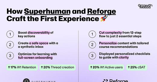
Onboarding Lab: How Superhuman and Reforge Craft the First Experience 🚀
2 first-hand stories about Onboarding evolution at Superhuman and Reforge.
A couple of months ago, in June 2024, I had the opportunity to co-host “Onboarding Lab” sessions with growth leaders from Loom, Superhuman, and Reforge (huge thanks to the team at Amplitude for making this happen 🙌). The insights and stories that emerged were simply too valuable to keep to ourselves, so I asked the participants if they’d be willing to share their learnings with a broader community through this newsletter—and they eagerly said yes!
In a recent newsletter, we kicked off the series by diving into Loom’s onboarding journey, exploring how they used AI and tackled psychological barriers to drive engagement. Today, I’m excited to continue the series with two more incredible stories:
How Superhuman redesigned its onboarding experience to help users adopt key actions faster.
How Reforge reduced friction in their onboarding flow from 12 to 2-step Onboarding, driving engagement with personalization.
And of course, I’ll be sharing key takeaways you can apply to your own onboarding processes. Ready to dive in? Let’s go 👇
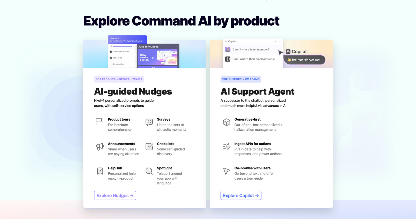
Brought to you by Command.ai — a user-focused platform offering an alternative to traditional popups or chatbots. Their AI “Copilot” answers questions, performs actions, and simplifies complex tasks. Use “Nudges” to guide users with timely, relevant messages, all within a no-code platform. Perfect for Product, Support, and Marketing teams to positively influence user behavior while respecting their needs:
Session 1: Onboarding Evolution at Superhuman
I first came across Superhuman onboarding approach while chatting with
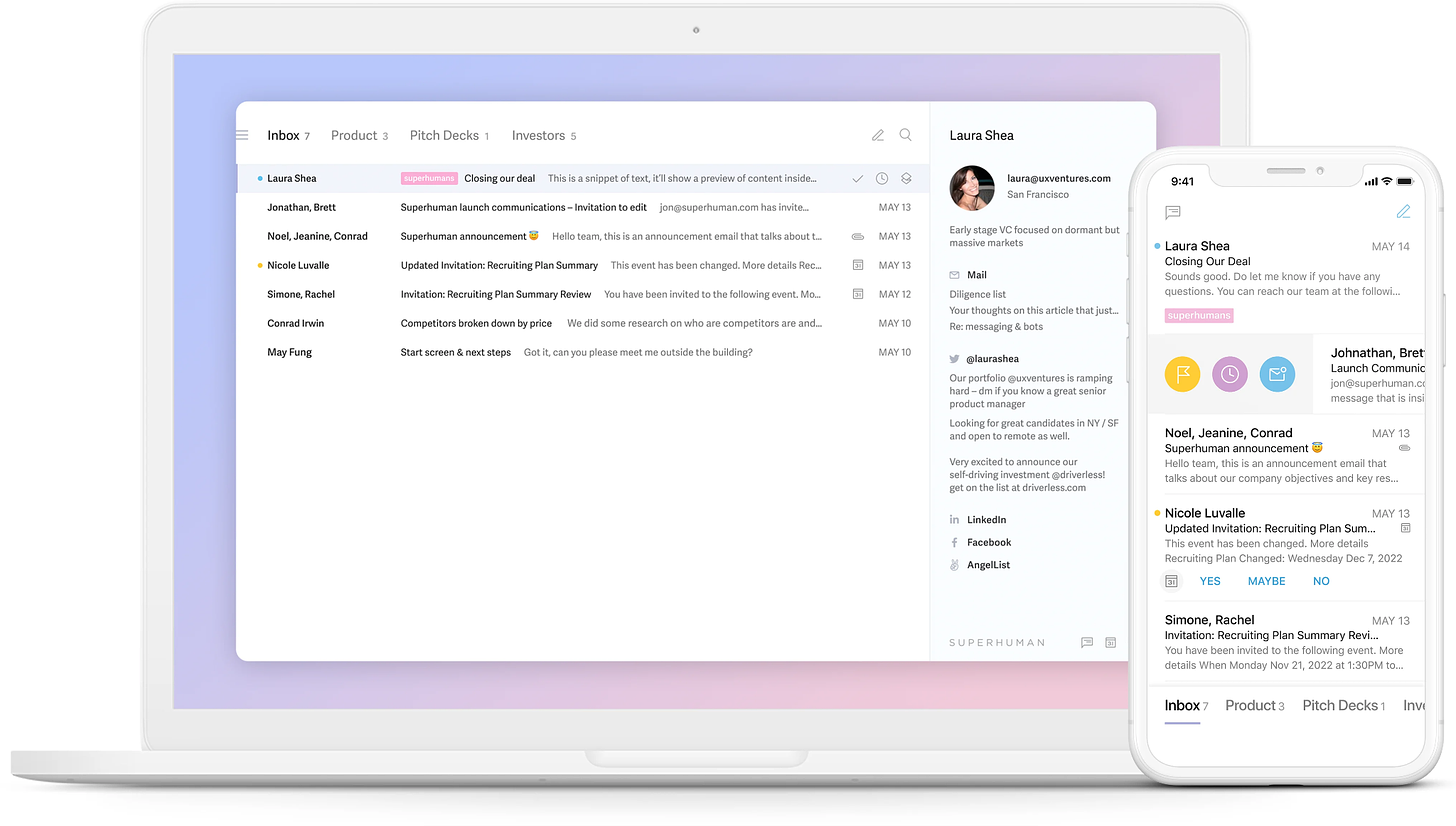
, one of their founding team members, in the Onboarding Lab session that we facilitated with Amplitude. Superhuman isn’t just another email tool—it’s built for speed, powered by AI, and designed to make reaching inbox zero a breeze. But here's the thing: getting users to actually break their old email habits and embrace Superhuman's efficiency isn't as simple as you might think.Let’s dive into how Superhuman creates an onboarding flow that not only teaches users new tricks but rewires their email habits, all while delivering an experience that feels like a game-changer from day one.
Start with defining your “Core Product Value”.
Superhuman is designed to give you the fastest email experience ever. With keyboard shortcuts at its core, it helps users speed through their inbox, processing emails in half the time. But as with any powerful tool, there’s a learning curve—especially when most users have spent years handling emails the “old” way. That’s where the onboarding process comes in, guiding users to master keyboard shortcuts, navigation, and archiving like pros.
🎯 Define your “Core Product Value” and deliver on promise.
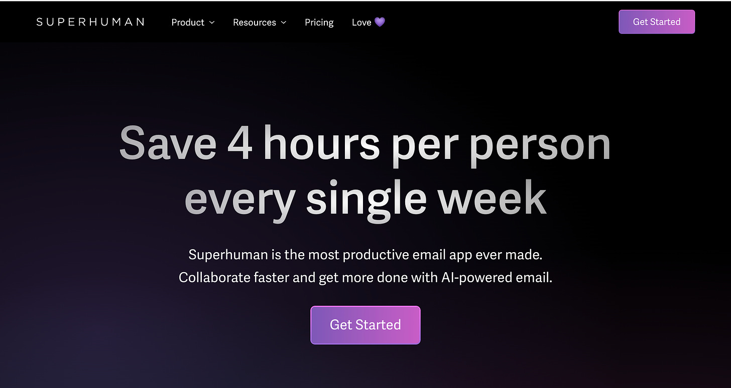
📌 Superhuman example: “Save 4 hours per person every single week. Superhuman is the most productive email app ever made. Collaborate faster and get more done with AI-powered email.”
Case study #1: From hands-on to self-service onboarding.
Initially, Superhuman’s onboarding was a hands-on, white-glove experience. New users were guided through their own inbox by Superhuman’s team, teaching them essential shortcuts like “J” for navigation and “E” to archive emails. While this approach worked, it had its limitations:
Inconsistent experience: Since users were working with their actual inboxes, some started with zero emails, causing the tutorial to fall apart.
Time-consuming: Manually onboarding users meant it took a while for users to experience the full value of the product.
Superhuman needed a way to offer the same high-touch onboarding but at scale.
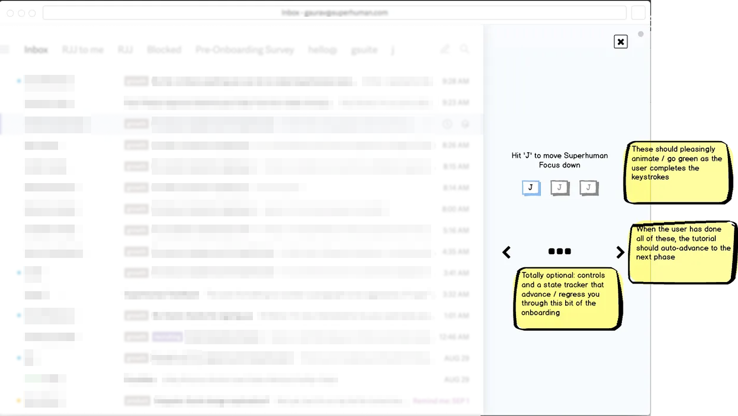
🔴 Before → Partial-screen Onboarding.
Picture this: you’re trying to teach users new email habits, but they’re working with their real inbox. Superhuman’s early onboarding process used a partial-screen tutorial, guiding users through their actual emails with instructions on the side. Sounds helpful, right? Not quite. This approach came with some serious drawbacks:
Inbox confusion: Users with empty inboxes found the tutorial breaking down since there were no emails to act on.
Risky actions: Teaching shortcuts like archiving in a real inbox made users hesitant—who wants to accidentally delete an important message?
Invisible instructions: The tutorial, tucked away on the side, was easy to miss while users focused on their inbox.
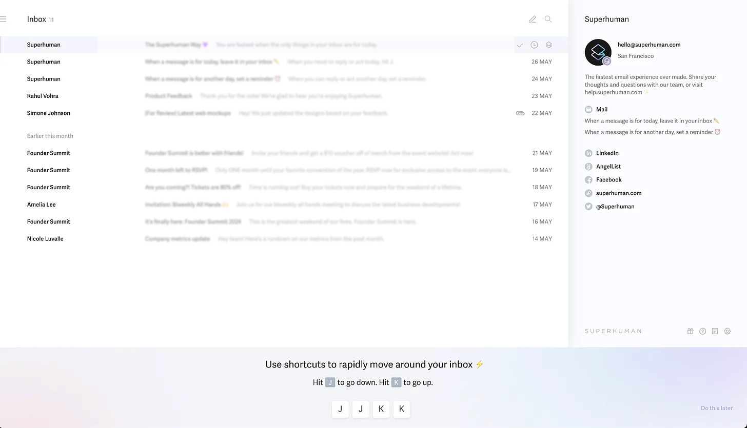
🟢 After → Full-screen Onboarding.
To fix this, Superhuman took a bold step and introduced a full-screen onboarding with a synthetic inbox. This game-changing move allowed users to practice in a sandbox environment—no real emails, no real consequences. Here’s how the magic happened:
Safe space to learn: With pre-filled emails, users could try out shortcuts like archiving and navigating with confidence, knowing nothing important was at stake.
Front-and-Center guidance: The tutorial was shifted to the bottom of the screen, making it impossible to miss and keeping users on track.
A consistent experience for everyone: Every new user got the same, high-quality onboarding flow, starting with a perfectly prepped synthetic inbox.
🎯 Results → Big Wins for Activation.
The shift from partial to full-screen onboarding had a huge impact on user behavior:
Avg. Shortcut Usage: a 20% boost as users became more confident with keyboard shortcuts.
Avg. Reminder Usage: a massive 67% increase as more users embraced reminders to manage their inboxes.
Week 1 Activation: a 17% increase in the number of users hitting Superhuman’s activation metric within their first week.
This transition resulted in higher keyboard shortcut adoption and a serious boost in user activation, helping new users truly experience the power of Superhuman, right from day one.
Case Study #2: When Improving UI Made the Difference.
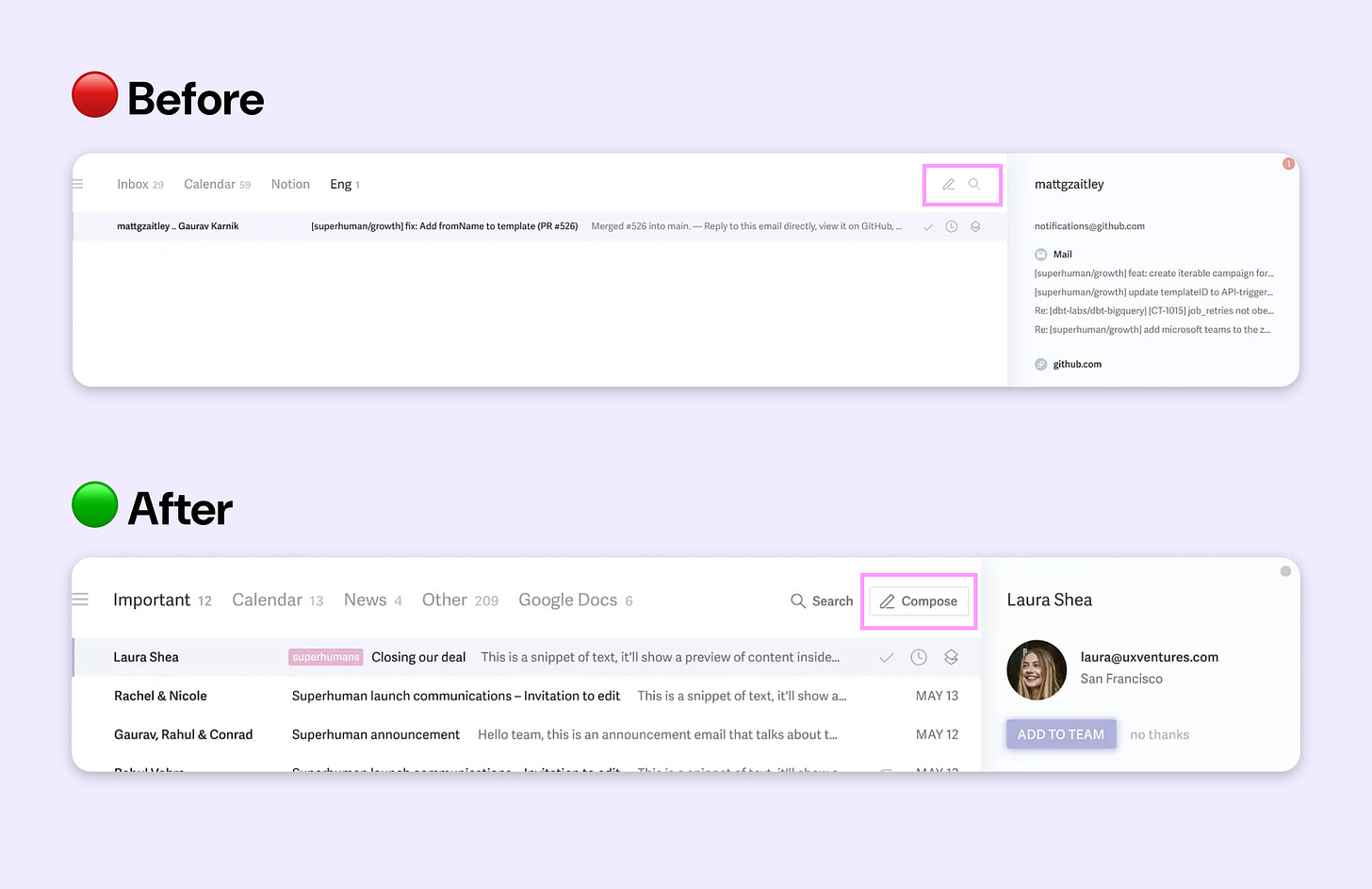
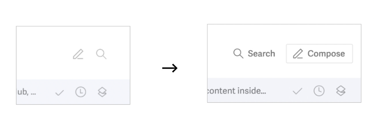
Spot the difference — noticing anything unusual? There are many differences here, but only one is significant enough to keep your attention.
🔴 Before → Minimal Icons and Low Discoverability.
Imagine this: you’re using a sleek, minimalist email tool like Superhuman. The product is designed to be clean and distraction-free, so the compose and search icons are kept tiny and tucked away. For experienced users who know the keyboard shortcuts, this is perfect—but for new users? Not so much.
Superhuman’s icons for Compose and Search were small, 15x15 pixels, and barely noticeable. New users, unfamiliar with the product’s shortcuts, struggled to find these critical functions. The result? Some users would leave the product without even composing a single email.
🟢 After → Improve Discoverability with “Temporary labels“.
To tackle this, Superhuman made a simple yet powerful change: they redesigned the Compose and Search icons to be larger, more visible, and added labels to help new users spot them easily. But here's the genius part—they didn’t want the UI to stay cluttered forever. After 7 days, these labels disappear, and the interface goes back to its sleek, minimal design for more experienced users.
This approach gave new users the guidance they needed at the start, but once they got comfortable, Superhuman returned to its signature minimalist look.
🎯 Results → Quick Fix, Massive Impact.
What started as a small design tweak led to big improvements in how new users interacted with Superhuman:
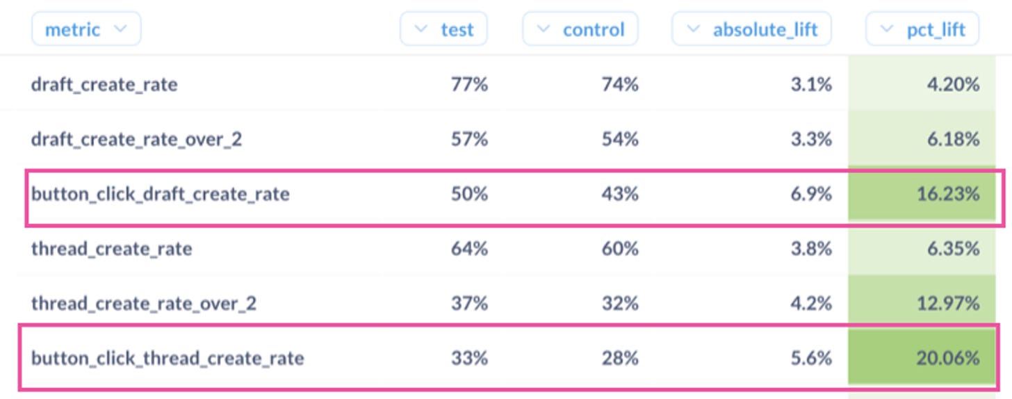
Button Click (Draft Create Rate): The percentage of users clicking the compose button increased by 16% , leading more users starting to write emails.
Thread Create Rate: Jumped by 20%, showing that more users were successfully composing and sending emails.
Week 1 Activation: The improved discoverability also contributed to an overall boost in activation, as more users were able to quickly get familiar with the product.
Why this worked? This change was the perfect balance between keeping Superhuman’s minimalist aesthetic and ensuring new users didn’t feel lost. By providing clear visual cues at the start, Superhuman gave users the nudge they needed to explore the core features. Then, as users grew more confident, the UI got out of the way, letting them focus on speed and efficiency.
Session 2: Onboarding Evolution at Reforge
After diving into how Superhuman optimized their onboarding flow, let's switch gears and look at how Reforge, a professional development platform, tackled their own onboarding challenges.
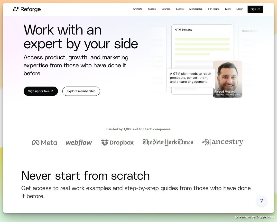
We all know that Reforge helps tech professionals, particularly those in product, marketing, and growth roles, accelerate their careers through courses and frameworks taught by industry leaders. I had the pleasure to host an Onboarding Lab session with Gianna Sen-Gupta — Product Lead at Reforge.
🔴 Before → 12-Step Overwhelming Onboarding Process.
Reforge’s initial onboarding process wasn’t exactly a breeze. Picture this: a 12-step flow full of questions and information, designed to collect detailed user data right from the start. While the intention was to personalize the experience, this long and content-heavy flow came with its own set of problems:
Information overload: New users were immediately hit with a ton of questions, making the process feel like a slog—especially for those who weren’t fully familiar with Reforge yet.
Motivation gap: Many users, especially those coming in through team subscriptions, weren’t as motivated to fill out all the details and explore the platform right away.
Underutilized data: Despite collecting all this information, the system wasn’t fully using it to create a personalized experience, leaving users unsure of where to start.
The team needed to reduce the friction in onboarding and give new users a more intuitive, guided experience. The team wanted to balance simplicity with personalization, ensuring new members felt understood and supported from the get-go.
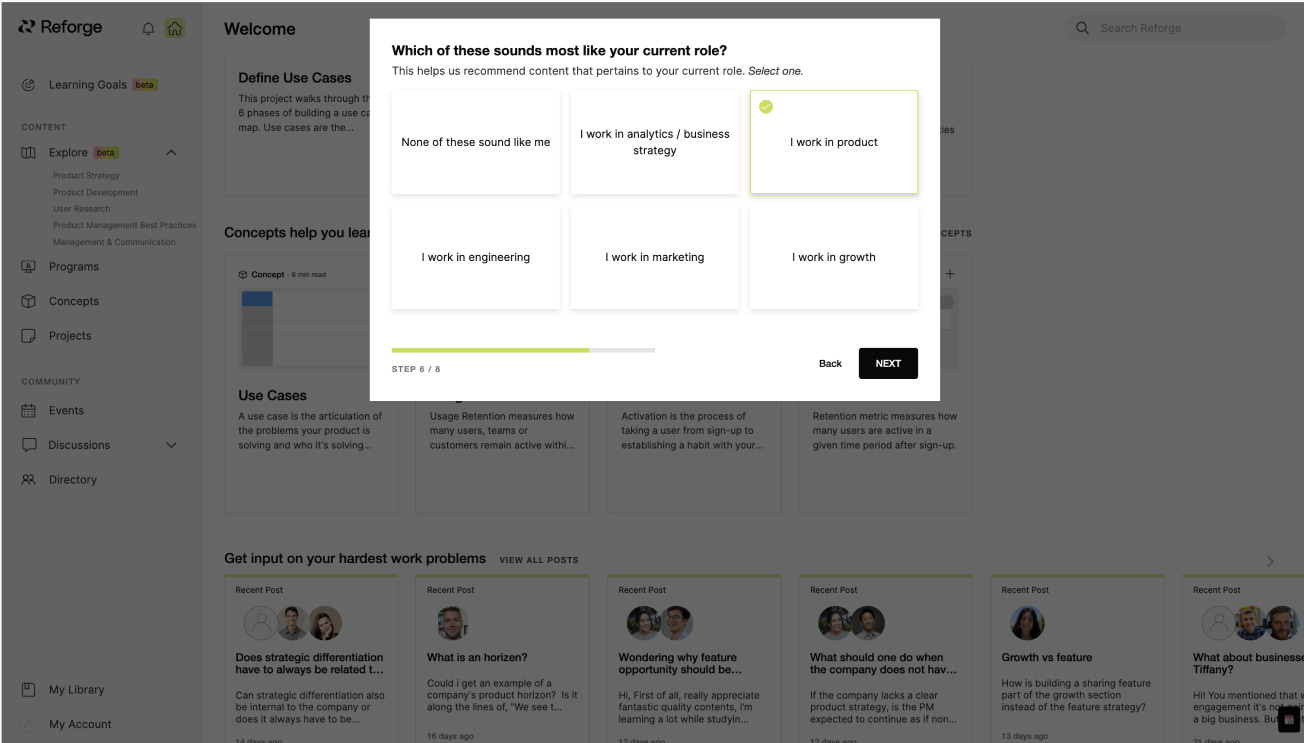
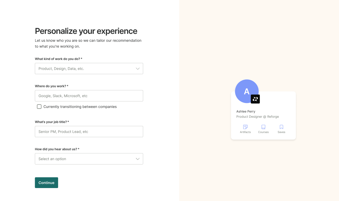
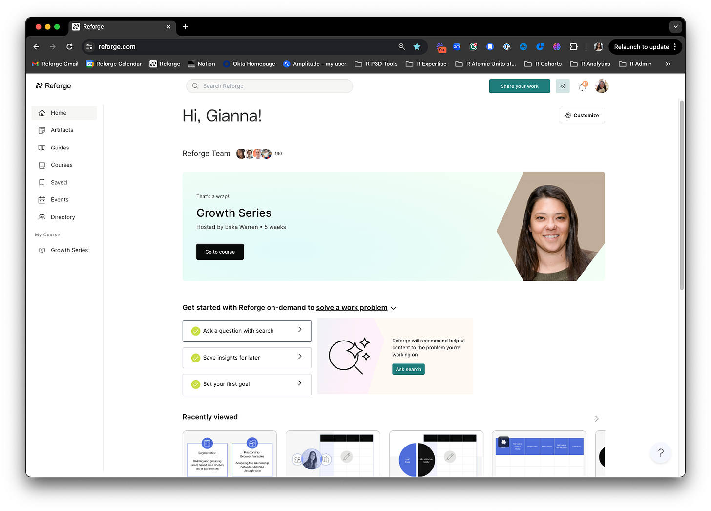
🟢 After → A Simple Two-Step Onboarding + Personalized Homepage.
To tackle these challenges, Reforge streamlined the onboarding process by cutting it down to just two simple steps, while also revamping their homepage to make it more personal. Here’s what changed:
Two-Step onboarding: Instead of overwhelming users with a barrage of questions, Reforge distilled their onboarding down to the essentials. Now, users only had to answer a couple of key questions (like their role and how they found Reforge), which were used to tailor the experience right from the start.
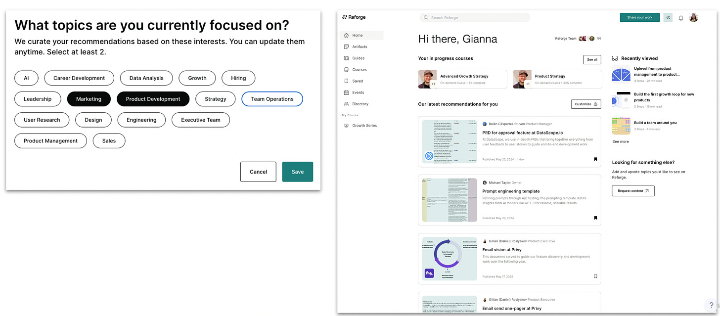
Personalized homepage: Gone was the content-heavy homepage of old. In its place, Reforge introduced a cleaner, more personalized experience, showing users relevant courses, a customized checklist, and a clear path to getting started. Each user now saw content that aligned with their role and interests, making the product immediately more engaging.
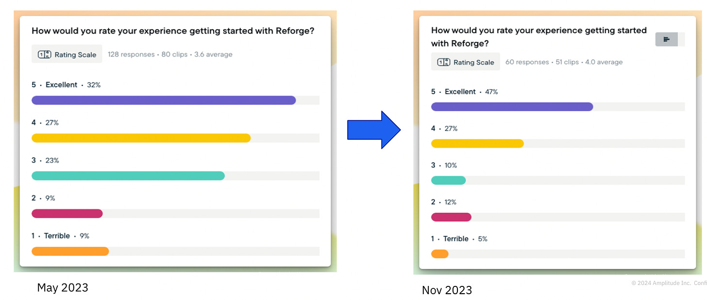
🎯 Results → Higher Engagement, Happier Users.
The results were clear—and impressive:
Active Users (First 7 Days): The percentage of active users (those consuming content within their first week) increased by 20%, showing that more users were diving into relevant material right away.
Supporting Actions: Users were more likely to engage with features like the search tool (powered by a new LLM-based engine), which helped them find hyper-specific content faster. This led to better content discovery and higher engagement overall.
Customer Satisfaction: The team saw a 25% improvement in customer satisfaction, with users reporting that the simplified flow made it easier to get started and understand the value of the product from day one.
Through user research, it became clear that Reforge members wanted more personalized recommendations for courses and content. The new onboarding flow addressed this head-on by leveraging the initial profiling information to surface highly relevant resources and courses.
This personalization was "picking up where you left off," helping users seamlessly continue their learning journey, making the platform feel more intuitive and tailored to their needs.
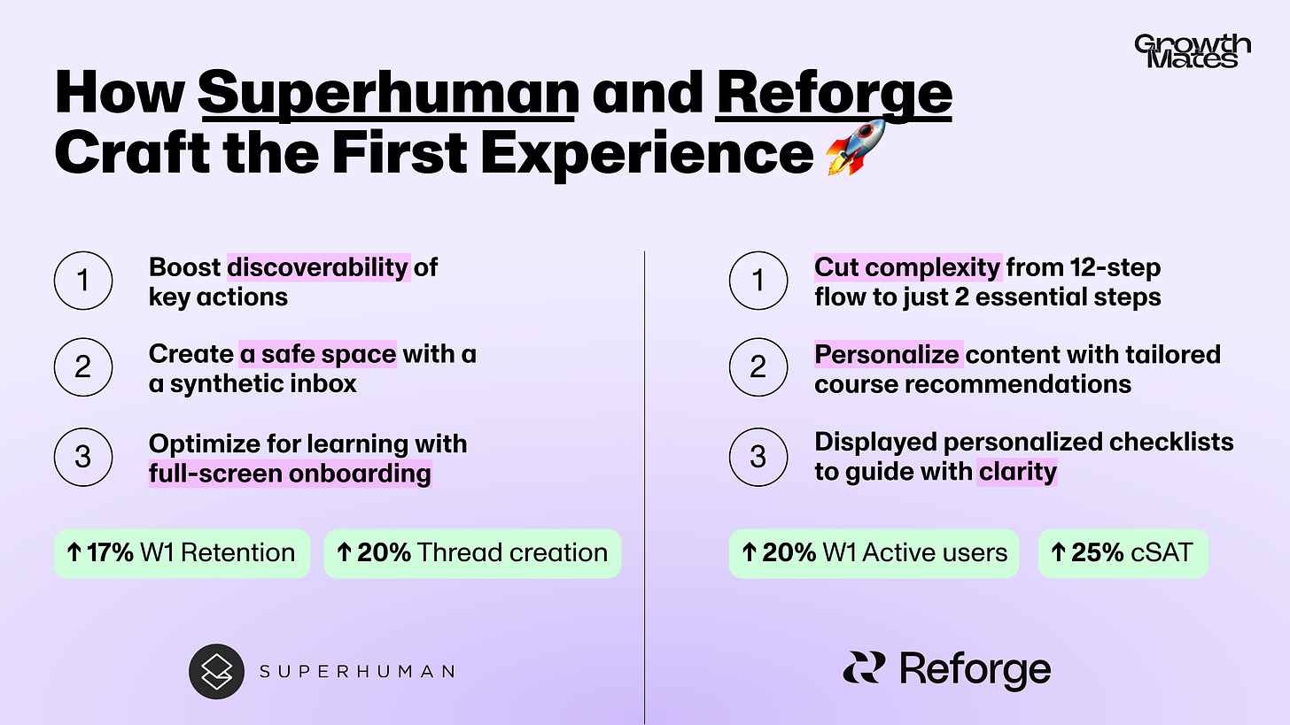
⭐️ Summary and Key Takeaways
We’ve explored how Superhuman and Reforge successfully enhanced their onboarding processes to boost user engagement and activation. Here’s what you can apply from these learnings to your product:
3 Takeaways from Superhuman:
Boost discoverability of key actions: Enlarged key actions (Compose,) and added temporary labels to help new users navigate faster. 👀
Create a safe space: Used a synthetic inbox to let users practice shortcuts without real consequences. 📥
Optimize for learning with full-screen onboarding: it helped users quickly adopt core actions, boosting engagement and activation. ⚡
3 Takeaways from Reforge:
Cut complexity: Reduced a 12-step onboarding flow to just 2 essential steps to prevent overwhelming users early on. 🎯
Personalize content: Tailored course recommendations based on user input, making the experience more relevant. 📚
Guide with clarity: Displayed personalized checklists and relevant content to create a clear path for success. ✅
By simplifying onboarding, personalizing user experiences, and guiding users with clear, tailored actions, both Reforge and Superhuman have significantly improved their activation rates and user satisfaction. Apply these strategies to create a more engaging and effective onboarding process for your own product!
P.S. Did you know that I’m also helping companies by conducting an Onboarding Audit to uncover growth opportunities and UX improvements? Book an intro call with me, and I’d be happy to discuss your challenge and explore how I can help
This is all for today, dear readers. If you found this helpful — please share this with your like-minded colleagues and friends, it would give a huge support for me to continue creating this 💜
With best regards,
Kate Syuma


