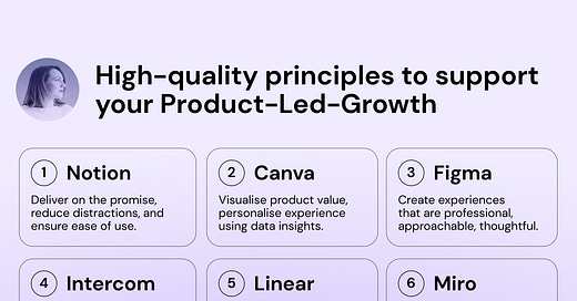
High-quality principles to support your Product-Led-Growth
How companies like Notion, Canva, Figma, Intercom, Linear, Miro are defining high quality + examples from their User Onboarding 🎁
The “Quality OR Speed” dilemma is not new in the product world. However, in Growth teams it’s been a constant challenge to make this trade-off in prioritisation and decision-making. But what if we look at this not as a sacrifice, but as an opportunity to deliver with both “Quality AND Speed”? The term “PLG” or “Product-led-growth” starts with the word “Product”, meaning the product itself and its quality create a necessary foundation for Acquisition, Activation, Monetization, and other growth leverages.
Simply, if the product itself is NOT providing an intuitive user experience — it’s NOT self-servable. If the product is not self-servable, it can’t successfully apply the PLG approach.
Growth teams are working on not only PLG strategies but also delivering high-quality experiences to end-users. The outcomes of Growth teams should be tightly linked to the quality delivered to end users, not only to scoring the metrics on OKR traction. Historically, Growth teams gained the reputation of optimizers for higher speed and sacrificing core product experience. I’d like to break this stereotype.
If we just take a moment to reflect on products that achieved real success, these products have both components: high-quality user experience and ethical PLG strategies. I don’t think companies can be successful by compromising UX or using “unethical growth hacks”.
Here are some examples of companies with both high-quality UX + PLG:
🔹 Notion: great UX for content organization + PLG freemium;
🔹 Canva: variety of use cases for creators + PLG for individuals and teams;
🔹 Figma: advanced functionality in a browser + PLG network effects;
🔹 Intercom: enhanced UX for a complex platform + PLG on top of Sales-led motion;
🔹 Linear: clear UX for product development + PLG with powerful paid features;
🔹 Miro: focus on intuitive experience for non-designers + PLG from the early days.
I decided to take a deeper look into these products and uncover how they define and deliver high quality.
What you can find in this story:
Overview of 6 products and what are some quality principles these companies follow;
How they apply high-quality principles in action (on User Onboarding, in particular);
Key takeaways to start thinking about high quality and PLG in combination.
Luckily, I had a chance to talk directly to leaders from some of these companies and have them as guests on Growthmates, so the insights they shared helped uncover interesting patterns.
Let’s take a look at 6 products to uncover if there’s anything unique in their approach to achieving a high-quality bar as a foundation for their Product-led-growth.
[1] Notion: Deliver on the promise, reduce distractions, and ensure ease of use.
I was an early adopter of Notion since 2017 and observed how the team progressed through Freemium and evolved to the current state of $10B valuation. However, I was more interested in finding some principles that guided the team to focus on quality.
📌 What makes Notion a high-quality product?
Delivering on product promise. As mentioned in “How Notion Grows”, Notion has been focused on creating an “all-in-one workspace”, and while communicating the value across different marketing surfaces (Website, Product Hunt, etc.), Notion did deliver its value to end users before starting to build a PLG motion.
Reducing distractions. At different steps of the journey, the product makes sure to keep the focus on the work, and not on the product. The minimalist interface supports that principle.
Ease of use. The building blocks and new formatting UX required a bit of a mental model shift, but the UX was designed in a very intuitive way. Despite the novelty of this way of organizing documentation, the “easiness of use” helped to achieve a high level of product adoption.
📌 How Notion delivers quality in User Onboarding
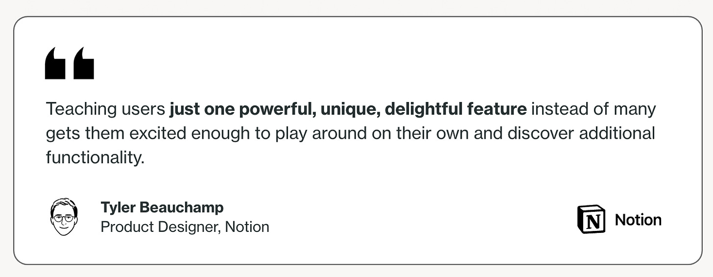
I had a chance to ask Notion how they’re tackling user onboarding while gathering data from 80+ companies for the Onboarding report. The insights that the team stood out, here’s one of them.
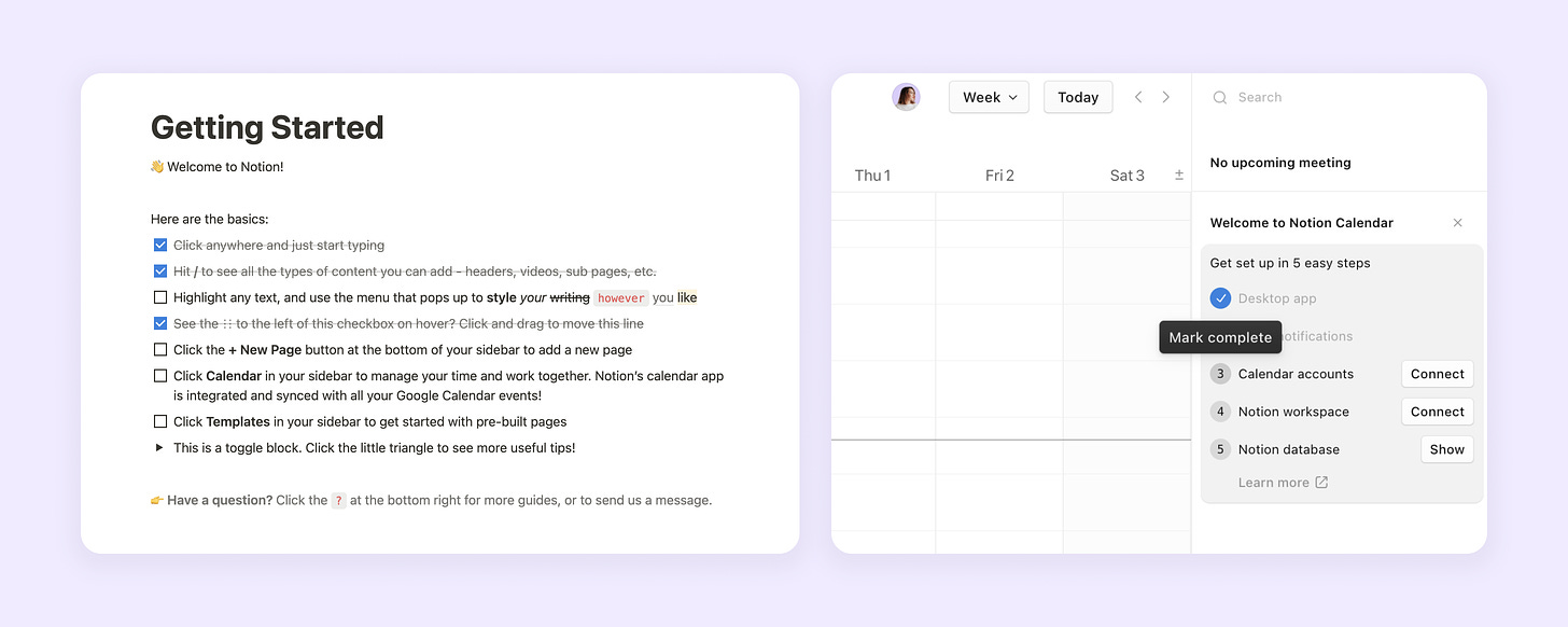
How does Notion deliver on that promise? I checked their main product onboarding and a new Notion Calendar flow to uncover.
👍 Example of high quality
Checklist is one of the most familiar patterns for Onboarding & Activation. Notion is utilizing it in various ways:
“Learn by doing” while onboarding through the “Getting Started” page;
Applying a familiar checklist pattern in Notion Calendar;
Creating a limited number of steps, and each of them is connected to the most important features in the first experience (formatting, organization, sub-pages, templates). Eventually, using this set of experiences leads to achieving an “aha moment”.
It’s easy, not distracting, and each step in the checklist reminds the user about the core value the product promised to deliver — an “all-in-one workspace”.
Learn more about “How Notion Grows” from in .
[2] Canva: Visualise product value, personalise experience using data insights.
Canva is a tool for visual, content, and brand creators with a valuation of around $39B. I’ve been observing the product for several years and recently used it myself as a creator while designing informational graphics for the onboard.report.
When we spoke to Iain Dowling (Growth Design Leader at Canva) on Growthmates, he mentioned the role of data insights in their product work:
Wee look for quality data insights, both qualitative and quantitative. So we're still building our research team for Growth at Canva. It's small but mighty, but we have a very, very strong data team and that data team started in the Growth team, actually years ago at Canva
Iain Dowling, Growth Design Leader at Canva.
📌 What makes Canva a high-quality product
Visualizing product value. Canva is a tool for creators who are primarily visual thinkers. So it’s very important to make sure that the product value is represented in a high-quality visual way, and then make sure to deliver this value and help non-designers produce better outcomes. Canva is achieving its value promise by constantly enhancing its Templates library with more high-quality templates.
Personalizing using data insights. Such a horizontal platform for a variety of use cases (docs, whiteboards, presentations) requires deeper segmentation and personalization to ensure users achieve Activation. Canva is doing it from the earliest steps of the journey — showing different products on the website, asking users about their needs, and then providing categorized templates inside the product.
📌 How Canva delivers quality in User Onboarding
When I asked Iain what’s the magic behind the way Canva builds the product and their recent product launch “Magic Studio”, he shared:
I think magic is Canva's way of representing the value that AI adds to the product and the customer experience. It's very important to always be thinking about how do we empower people with the latest tools and the latest technology.
It was a cross-functional, cross-company effort. Growth's role was similar to any new feature release, which is to maximize the engagement with the awareness of and the engagement with and the uptake of the new features that we release.
It was partnering with both Marketing and Core product folks to make sure all the new features were up there in lights, both outside and inside the product. We created these enticing flows that encourage people to try out the new features, and for new premium features to try them out and to hopefully upgrade to see a lot of value in those. And yeah, Growth had that same partnership with Core products and marketing as it has for previous big feature releases.
Iain Dowling, Growth Design Leader at Canva (Listen full story on Growthmates podcast).
When I explored User Onboarding at Canva, I found that a visual way of representing different features is definitely at the core of the product approach. However, it’s not just showing users the value, but also triggers them to interact and “play” with different functions in a safe environment.
👍 Example of high quality
Interactive presentation as a product walkthrough. As a user, you can interact with the product while learning the basics and even get back to it anytime. Creators as a key audience of the product are primarily visual thinkers, and product onboarding shows you in a visual format various features and capabilities. Moreover, the product unpacks a lot of visual templates for various use cases, making it easier to personalize the user onboarding experience.
Learn more about “How Canva Grows” from in .
[3] Figma: Professional, Approachable, Thoughtful.
Figma became a go-to tool for designers and product teams across the world and was almost acquired by Adobe with a $20 billion valuation. I’ve been using Figma since 2016 and still rely on it heavily when creating any hands-on craft. Based on my personal experience, I can ensure that high quality lies in the DNA of the product.
📌 What makes Figma a high-quality product
Nowadays it’s hard to find products that publicly share their quality principles, but Figma does. Let’s dive deeper into each of their principles.
Professional (Powerful, Precise, Systematic). Figma stood out at the beginning by providing powerful functionality in the browser to design professionals, and it was a game-changer for design collaboration.
Approachable (Predictable, Biased toward simplicity, Natural mental models). We can see the pattern of simplicity as a principle. Being mindful while introducing new patterns, and actively pushing the tool toward simplicity while naturally it bends toward complexity.
Thoughtful (Responsible, Detail-oriented, Respectful). The principle that resonated the most is Figma’s commitment to “research and test to understand true intentions of a user, not just assume”. This is a strong point that quantitative A/B testing is not enough if you want to deliver a successful product with the PLG model.
📌 How Figma delivers quality in User Onboarding
I decided to check how Figma approaches Onboarding in their relatively new sub-product FigJam — a tool for collaborative teamwork. I’ll make sure to share the full flow review in one of the next articles, but one solution that I particularly enjoyed was a contextual onboarding guide on the board. It’s relatively simple but also provides entry points to explore each of 3 core use cases — Diagramming, Meetings, and Brainstorming.
👍 Example of high quality
Interactive self-service demos. Figma combines intuitive navigation, uses simple copy for use case explanation, and applies visual guidance in one place. You can see the sense of progress, expand it to the large mode, and get back to this anytime after your first session with the product. According to our Onboarding research, a similar method was mentioned as one of TOP-3 successful onboarding experiments for B2B.
Learn more about Figma's influence in “The Legacy of InVision App” by .
[4] Intercom: “If we’re not being helpful, it shouldn’t exist. If it’s not adding value — it should be changed”.
is currently an all-in-one Al customer service platform that has existed on the market since 2011. The product had a lot of significant changes in its positioning, as well as shifts from pure Sales-led motion to a combination with PLG. Intercom also accomplished $50MM ARR in under 5 years, making it one of the fastest-growing products on the market. Recently on Growthmates, I’ve been talking to Thomas Rimmer, Design Director at Intercom, where he shared their philosophy when it comes to product quality and decision-making:
If we're not being helpful, then it shouldn't exist in the product. If it isn't adding value to a user, then it shouldn't exist, or it should be changed in some way. And then if you go down into our principles, they are really well documented. We look for things to be connected and modular, so they can be reusable and become familiar throughout the product. We follow fundamentals. We're not looking to reinvent the wheel on every single interaction, just the things that need to be bespoke and invented.
Thomas Rimmer, Design Director at Intercom.
📌 What makes Intercom a high-quality product
Intercom has a set of principles divided by categories — R&D, Product Design, Engineering. They are quite interconnected and I can imagine how this can be used to enhance the alignment between Product, Design, and Engineering stakeholders.
Let’s dive into some of these principles:
What you ship is what matters. This principle is well connected to the philosophy that Thom shared. If the experience is not helpful or is not adding value — it shouldn't exist. That simple.
Follow fundamentals. If there are familiar experience patterns for the target audience, there’s no need to re-create the wheel, unless this is the differentiator where you need to be inventive.
Make it feel personal. Adding a flavor of a human connection, not just talking to users as an emotionless interface.
📌 How Intercom delivers quality in User Onboarding
I’ve been looking through the User Onboarding at Intercom and uncovered a variety of methods they’re using. The product requires quite a complex setup, and I was glad to uncover that this complex journey is split into several “chapters” connected to use cases. For activation journeys and trial-based products, it’s a good way to simplify the first experience and navigate through the main steps to get to activation.
👍 Example of high quality
Splitting complex setup into multiple steps. For highly complex B2B products that are used to onboard users through the traditional human-touch approach with the help of Customer Success, it can be quite challenging to transition to a self-service approach. Intercom is splitting the setup into several modular chapters and steps, as well as adding human connection through copy and interface to re-create this familiar demo experience with Customer Success. Overall, the onboarding flow is quite complex and full of interesting insights, that I’ll try to share in my next posts.
Learn more about “Intercom’s culture of design” in the Growthmates podcast.
[5] Linear: Aim for clarity. Simple first, then powerful.
Linear is a relatively young product that positions itself as a tool for modern software development to streamline issues, sprints, and product roadmaps. I’ve been interested in following their journey from the early days, as Karri Saarinen (CEO and Co-Founder at Linear) has a design background (ex-AirBnb). In one of his recent posts, Karri mentioned several facts about the company:
Linear hit 5 years. Starting 2024 with:
- Team: 50 (100% remote in 16 countries)
- Linear runs product org for tens of thousands of companies, from startups to public companies
- 66% of Forbes top 50 AI companies use Linear
- $52M raised in total, still profitable, with a negative lifetime burn rate…Karri Saarinen, CEO and Co-Founder at Linear (LinkedIn post).
📌 What makes Linear a high-quality product
When diving deeper, I uncovered a Linear Method where the company explains its unique principles and practices. It’s quite interesting that the team is not relying on A/B-testing for decision-making, and probably it’s a smart decision for their current scale to keep control over a quality bar. Let’s dive into some components of the “Linear method":
Aim for clarity. Despite the complexity of software products, Linear seems to be clear, consistent, and intuitive. It also has this pleasant feeling like when you’re interacting with high-quality Apple hardware products, but here you can feel it in Linear software.
Simple first, then powerful. This principle is connected to personalization for teams of different sizes that have different problems to solve and, hence, require different functionalities. Progressive disclosure can be also another tactic to use — Linear doesn’t seem very complex at the beginning, but while progressing through the experience, the user can uncover a lot of powerful features (and it’s smart to make them available in higher tier options).
📌 How Linear delivers quality in User Onboarding
I didn’t want to add here another example of a checklist, guide, or any other component that is usually associated with User Onboarding. Another essential part of the Activation experience for a multi-player product that requires collaboration is invitation and sharing. Here’s the invitation experience of Linaer.
What I can say: it’s the one of most simple and intuitive sharing experiences I’ve seen in the last few years.
👍 Example of high quality
Intuitive invitation experience. Simplicity is at the core of this solution. The product is relying on the “power of defaults” by providing the easiest option to invite team members through the link. Finally, this experience is consistent throughout different touchpoints — during the Sign-up flow, in the Onboarding checklist, and as a part of the core experience.
Learn more “How Linear Builds Product” from .
[6] Miro: Ship experience you’d be proud of putting your name on.
Miro is a collaborative whiteboarding platform that is used by 50+ million users worldwide and has a $17.5 billion valuation. Before I switched to an independent journey, I’d been working at Miro for 6 years, started at a seed-round 50 people organization, and ended up at a Series-C unicorn of around 2000 people.
📌 What makes Miro a high-quality product
When it comes to my time at Miro, the focus on quality was just a part of internal DNA. There’s an interesting Mona Lisa principle described in “How Miro builds product”: “Simply put, everything we ship should be like a Mona Lisa painting, something we’d be proud of putting our name on. When you look at a painting, you can easily say that something is a masterpiece and something is definitely not; the same is true with the product.” The whole team was deeply focused on shipping high-quality experiences to customers, and inside Growth org I’ve led Design review sessions several times per week to maintain a quality bar in a fast-moving experimentation environment.
📌 How Miro delivers quality in User Onboarding
There are different definitions of “aha-moment” — the most popular one says it’s the moment when the user has experienced the core value of the product for the first time. It means that your product delivered the value “on promise”, while also reminding your user about that promise during onboarding.
👍 Example of high quality
A step ahead of that is creating a “delightful aha-moment” — meaning exceeding user expectations, while still delivering on promise. The “Say Hi” experiment is a simple “delightful experience” that can exceed user expectations about a traditional collaboration experience. You can dive deeper into my full story about “The Evolution of Miro’s Onboarding” in
.🎯 Key Takeaways
If you reached this point of this story, you probably started noticing patterns in how different companies approach high quality. Let’s look at 3 themes I identified:
Use simplicity as a principle, as your product will naturally bend toward complexity. For B2B tools that are growing by adding functionality, it’s quite common to become complex over time. Then these tools encounter the challenge of creating an efficient self-serve user onboarding. Toolks like Figma and Linear could easily land in this category if they didn’t focus on simplicity from the first days. It can cost you a lot of effort in the future to onboard users at scale into a complex product if you don’t keep complexity under intentional control.
If your product delivers high quality on its promise, you can rely on the product itself for user onboarding. For reliable PLG-motion your product needs to be self-servable, so users can assist themselves with everything hands-on. In this case, you can create onboarding experiences that are embedded into the core product — like Notion and Canva examples.
Personalizing experience is a way to simulate the human connection that self-service products are usually missing. We don’t want our users to feel lost and isolated inside digital products, especially when users are exploring the product for the first time. Personalization can be delivered in different shapes — calling users by name, suggesting templates, or even involving familiar human voices and faces while guiding users through your platform.
P.S. Did you know that I’m also helping companies by conducting an Onboarding Audit to uncover growth opportunities and UX improvements? Book an intro call with me, and I’d be happy to discuss your challenge and explore how I can help
I hope the stories of different products can inspire you to think about your product quality from a new perspective.
If you found it useful, I have one friendly ask to you 👉 share it with your team and dedicate time to have a deep conversation about your product quality.
Is there any other product you would add to this list? Share your thoughts and recommendations in the comments on this article. I’ll use it as an inspiration to write more stories for the community. 😉
I am venturing to understand PLG strategies. Apparently it needs the lenses of a designer
Nicely put. Enjoyed reading Notion. Will bookmark the article to read about each company thoroughly! Thank you, Kate, for the detailed explanation.