From Old to New Ways: 6 Methods to Drive Activation and Adoption
Evolution from a tooltip, and spotlight search, to a variety of learning methods.
For the last 6+ years, User Onboarding and Activation have been at the top of my mind. Last year I dove deeper into it with Onboarding research and collected insights from 80+ companies like Notion, HubSpot, Coda, and more. Since then, I have started helping companies with holistic Activation & Onboarding Audit, created and shared 5-step Growth Framework, and today I’m happy to share fresh insights on this topic in collaboration with James Evans (CEO at CommandBar).
Introducing James Evans (CEO at CommandBar)
James is a fantastic product leader who believes in the synergy of user experience and business impact as I do. As a Co-founder and CEO at CommandBar — an Insight-backed startup that received $24 mln in funding, they were creating solutions for adoption from spotlight search to net-new methods. Along that way, they learned why the “old way” is no longer performing, and what kind of “new ways” we need to unpack to drive activation & adoption steadily. Keep reading to find this out 👇
What we cover in this post:
Why are learning methods always changing?
Method 1: Tooltips and What’s wrong with them
Method 2: Product Tours and how to improve them
Method 3: Support chat with AI support
Method 4: Checklists and how to drive action
Method 5: Surveys as valuable “micro-surveys”
Method 6: In-app Help with more relevant content
Let’s dive into each of them 👇
When your product powers user experiences for over 20 million end users, you get a behind-the-scenes look at user behavior. Whether it’s product tours, resource centers, onboarding checklists, surveys, data consistently shows us:
The status quo of onboarding, activation and engagement tactics is broken.
Interfaces are so stuffed with annoying popups and useless chatbots that users now instantly dismiss the “help” we offer until they’re all on their own again.
We’ve built our product, CommandBar, to help companies assist their users in ways that are actually useful and actually drive the engagement we want to build.
We offer similar form factors as the annoying in-app “help”: Checklists, tours, chat interfaces, etc. But because we’ve seen that non-annoying ways improve things for both users and product teams, we’ve built counterintuitive things: Hyper-specific targeting, behavioral triggers and deep integrations.
We didn’t start CommandBar with these insights—they come from many, many experiments (many of which didn’t work). In this article, I’ll share what I wish I’d known about building non-annoying user assistance when I started.
I’ll walk you through the most common in-app widgets, why their status quo frustrates users and how to improve them to ensure they actually help users so you can see the engagement/activation numbers you want to see.
Why are learning methods always changing?
We’ve come a long way from the days when the only help users could get was on page 38 of a ring binder. Things have changed: Sign up to a SaaS app nowadays and you’ll see 3 months worth of feature announcements, a product tour and a checklist.
We’ve gone from too little help to way too much help.
Two important shifts caused this:
Platform shifts: The move to cloud computing made it easy to ship new experiences without waiting for release cycles.
User behavior shifts: Users are now using dozens of tools every day. This has made users less tolerant of complicated interfaces.
Users now complain about 5 second loading times and tiny UX writing blemishes. Great UX has gone from differentiator to table stakes. The rise of AI is now creating another transformation in how users navigate interfaces and the experience they come to expect.
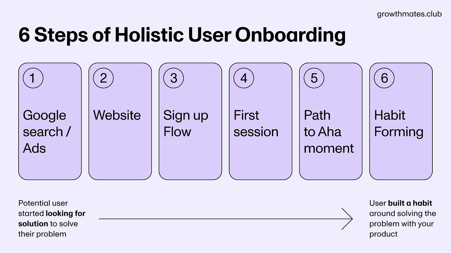
User Onboarding is the first and the last thing most users see before they leave. But User Onboarding ≠ First session. We need to think of that holistically. In my recent survey of 100+ companies, almost 43% highlighted that “Improving Activation and User Onboarding” is “VERY challenging”.
There are at least 6 phases of User Onboarding we should consider: it starts when a potential user started looking for solution to solve their problem, and it ends when user built a habit around solving the problem with your product
Kate Syuma, Founder at Growthmates, Growth Advisor (ex-Miro)
Method 1: Tooltips and What’s wrong with them
The old way 🔴
Tooltips are one of the simplest UX widgets: The user hovers or clicks an element and a little modal appears that helps the user understand that part of the product.
They only open on hover, so they’re rarely annoying. But for the longest time, tooltips only included static text—a one-size-fits-all explanation.
An example:“When you press send, your email will be sent to your selected email list immediately.”
The new way 🟢
Tooltips used to be static text, but can now be more dynamic. In an email marketing software, hovering the “send” button, might surface a tooltip that says “When you press send, your email will be sent to your list immediately.”
We can now interpolate user data:
“When you press send, your email will be sent to 8,439 contacts. You have 3 email sends remaining this week.”
This makes the tooltip more useful by directly answering the next question a user may have. Users don’t have to navigate to their account settings to find out these things.
But that’s not all: Tooltips can also be entry points to other experiences. A link to documentation or a button that launches a product tour can offer further assistance to users who need more information.
You can also personalize tooltips now. Someone on a starter plan might hover an enterprise feature and get a tooltip that they need to upgrade. An enterprise user would get an explanation instead.
Tooltips are useful in many parts of the user journey, but are most important to help users understand new (to them) features.
Most important UX principle 🤓
The most important UX principle behind tooltips is that they’re user-initiated triggers: Users are hovering the feature/button/setting, so they’re already curious.
Where this is most useful 🌿
Tooltips can be ubiquitous in products without being annoying because users only see them with intent. That said, tooltips exist to teach users an interface, so they’re most useful for activation.
What’s the impact 🚀
Adding (good) tooltips to your product is a great way to help users understand features more without writing support tickets, which increases engagement.
Method 2: Product Tours
When you sign up for a new software product and get shown a tour, your instinct is probably to dismiss it instantly. Product tours started as a novel way to learn an interface, but turned into a nuisance. Even when they’re annoying, they help with onboarding, activation and engagement.
The old way 🔴
The status quo keeps product tours below their potential when it comes to onboarding and engaging new users.
It’s usually the product team that decides when a user sees a tour. The most common triggers are:
New sign-up
First time using a feature
On page load
This is part of what makes them annoying. Users feel like the experience is forced on them—which it often is. This is why many users dislike product tours: It’s not that they don’t want a tour, it’s that timing is inconvenient.
Most product tours are also one-size-fits-all. The enterprise admin gets the same product tour as a college student on a free trial. This requires long tours that try to please everyone—and end up pleasing no one.
The new way 🟢
At CommandBar, we’ve found a few ways to trigger product tours in a more user-friendly way:
Giving users the choice: Instead of triggering a tour, we can offer a tour. If the user clicks a button, the tour launches. If not, they can skip it and take the tour another time.
Behavioral targeting: When users are clearly confused or angry, we can offer a tour to help them.
Timers: We can offer users a tour when they’ve been inactive in a given screen for a certain amount of time.
All of these make product tours more convenient for users. But the right timing doesn’t help if it’s the tour itself isn’t great.
The future of product tours are shorter, more personalized tours. Let’s take Hubspot as an example. Instead of showing everyone every feature, a marketer should get a short tour of the email marketing product while an analyst should be shown analytics.
The data that allows us to customize the tours we show also enables us to customize the content inside the tours.
Instead of “Here’s where you’ll find AI features”, a step could say “You have 100 AI uses every month, here’s where you can use them”, while another plan would see a different number.
Most important UX principle 🤓
Product tours primarily reduce cognitive load. The more cognitive resources users need to learn or use your interface, the less likely they’ll do so. But a new interface always has high cognitive load because users don’t understand it yet.
Product tours reduce cognitive load by focusing the user’s attention on one element at a time.
What’s the impact 🚀
Product tours are the example of improving user activation and onboarding. Some non-onboarding use cases are increasing retention by showing users what they unlocked after an upgrade or activating existing users by walking them through redesigned features.
Method 3: Support chat
The promise of support chatbots is simple: Deflect the easy support tickets that are resolved with “read this help article” and let your support team focus on the cases that require real problem-solving.
The old way 🔴
As users, we rarely think “finally, a chatbot!”. That’s because most of them are useless. They offer help in the bottom right corner, but rarely provide it. You type in a question and get unrelated documentation or a 17-step GPT answer (effectively documentation).
This has trained users to dismiss them or harangue them to get connected with a human agent ASAP.
This wasn’t because companies didn’t try. The technology wasn’t there. Before AI, building chatbots was as annoying as using them. You had to build giant tree diagrams users had to perfectly navigate. Outputs from natural language prompts were spotty at best.
LLMs remedy much of this. They tolerate various user inputs and can use RAG to query documentation to offer an answer. But if pre-AI chatbots had too few capabilities, off-the-shelf AI has too many.
Air Canada lost a lawsuit because its AI chatbot promised a discount that didn’t exist. A Chevrolet dealership became the butt of jokes online when its GPT-powered chatbot offered a user a brand-new Chevy Tahoe for $1.
Even if an AI chatbot doesn’t lead to ridicule and lawsuits, they often merely provide documentation in a smaller window. But AI can do much more than that.
The new way 🟢
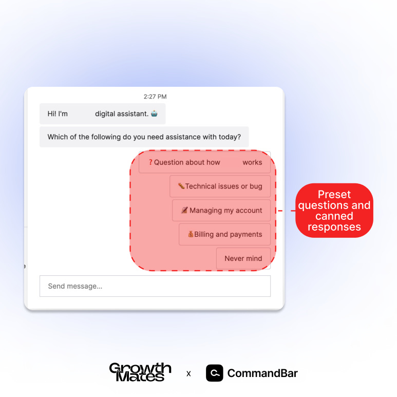
In chat interfaces, the difference between the old way and the new way is most stark: Full AI support agents can assist users with more than text:
Powerful AI support like we’re building at CommandBar can directly fulfill user intents. A simple example of this could be dark mode. Instead of telling the user the step-by-step navigation to find the setting, it can just surface a button which does that thing.
But they don’t need to stop there. Another example (that mirrors human support agents) is executing workflows directly. With a bit of integration AI support agents can call APIs to fulfill more complex queries:
By integrating with backend APIs, AI support agents have access to the same data a human agent would use to resolve a case.
By integrating with backend APIs, AI support agents have access to the same data a human agent would use to resolve a case.
A simple chatbot might answer “to find your order status, follow these 5 steps” while an AI agent could query an API with the order number to retrieve the status directly.
That way, they can deflect tickets and guide a user throughout their journey with your product. But AI agents don’t need to be limited to text output: If an AI support agent integrates with your product tours, surveys, etc., it can also launch them from the chat interface.
As the capabilities of AI support grow, users will trust them (again). They become the first line of defense for support requests while humans handle the tricky stuff that requires real problem-solving.
Most important UX principle 🤓
The most important UX principle to keep in mind is user trust: If users interact with any given widget and get a negative outcome, they will trust it less. A positive outcome increases trust.
This matters especially for AI chat support. Users might only see a product tour once, but they engage with support chat more often. If your AI chat doesn’t build trust (and keeps it), users will disengage and just email your support email address again.
What’s the impact 🚀
Having a deeply integrated AI support agent could transform how we use interfaces. What if an intelligent assistant could reduce most of your interactions to a simple text query?
For the time being, their main use case is deflecting support tickets—especially the easy stuff that human support agents already dislike.
Method 4: Checklists
Checklists are similar to product tours: They’re most common during onboarding and help activation and engagement.
But while product tours drive understanding, checklists drive action.
The old way 🔴
First, many checklists are long and boring. If your software signals to users that they’ll need to complete 12 boring steps to use it, what does that say?
Checklist steps are also often driven by the wrong incentives and include steps that help drive later monetization (“invite 5 teammates”) but come way before users have had the time to realize the product’s value.
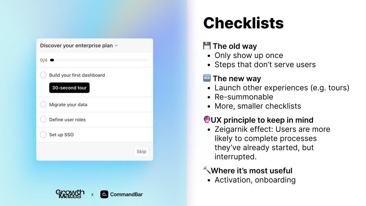
Another thing that harms UX is that they often vanish after one session or once a user closes them. Users might want to complete the checklist later—but then it’s gone.
The new way 🟢
The future of checklists is similar to that of product tours:
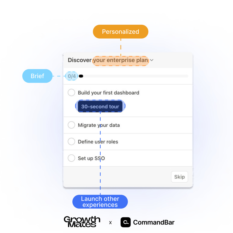
More personalized: Customize checklists to user properties and parts of the product. You could have a short checklist about managing your team that only enterprise admins ever see.
More, smaller checklists: Instead of a one-size-fits-all checklist, you can create multiple checklists about specific parts of the product that trigger the first time someone uses them.
Checklists are often most powerful in combination with other experiences. Clicking a step on a checklist could launch a short tour of that specific feature. “How do I get started” in AI support could summon the checklist about that feature.
Most Important UX Principle 🤓
An important user psychology effect here is the Zeigarnik effect: Users are more likely to complete processes they’ve already started, but interrupted. Once a user starts a checklist (especially one that persists across sessions), they’re more likely to complete it.
What’s the impact 🚀
The most obvious impact of checklists is during onboarding. But they can also subtly influence monetization. By adding a step like “invite teammates” towards the end, you can sell more seats later on.
A checklist can also help with retention. If a user just upgraded, you can help them get the most out of their new plan and get them to use more of the paid features, making them less likely to churn.
Method 5: Surveys
Gathering data is annoying: Users have low motivation to fill out long questionnaires and your email competes with hundreds of others in the inbox.
The old way 🔴
The reason most surveys are annoying is because they’re launched with an antiquated process: The product team wants to do a project, so they start by gathering data by emailing a long questionnaire to their user base.
This is annoying because it’s easy to spend 10 seconds answering a small survey while already in the product, but hard to spend 10 minutes when you’re checking your email.
The new way 🟢
We believe (good) in-product surveys are the better way to gather data. That’s mainly because users are already in your product, so the ideas are fresh and they don’t need to expend cognitive effort.
We believe we’ll see more “microsurveys”, short questions specifically targeted at users for the part of the product they’re in. This lowers the burden for users and ensures product teams already have the data they need for new projects because it’s always being gathered.
We’re also seeing surveys being layered with other experiences. An example could be right after/during a product tour or when someone used a feature for the first time.
Most important UX principle 🤓
The psychological principle behind this is recency: The more recent an experience, the more “available” it is in someone’s mind, which lowers the effort to fill out a survey.
What’s the impact 🚀
Surveys don’t directly improve the in-product experience. But the insights you generate from them fuel your roadmap and help you identify sticking points and user needs—which ultimately helps you improve your product in all aspects.
Method 6: In-app Help
Resource centers have a similar reputation as chatbots: They’re annoying pop-ups to get rid of.
The old way 🔴
Resource centers (the little windows with blog articles and documentation) were created to help users, but now mostly serve as blog article showcases. At best, they offer generic documentation.
The new way 🟢
But resource centers are becoming more useful: When integrated with other experiences, they can launch tours about specific parts of the product and offer other engaging formats like videos.
But the type of content is less important than the selection of content. Like with other widgets, personalization is the future:
Based on user: We can default to specific content for the audience a user is in or a behavior they recently exhibited.
Based on page: By offering specific resources for the page they’re on (settings, features, etc.), users can find help for what they need.
But AI also impacts resource centers: That’s why I believe all resource centers should have search (ideally AI-powered) that can surface other experiences:
Search gives you data for intent future intent targeting—and for potential new content to create
Search can help the user find what they’re looking for, even if it’s not in the suggested content.
This way, a good resource center becomes a great source of user intent data while also helping lower the burden on support by helping users help themselves.
Most important UX principle 🤓
The familiarity bias dictates that users prefer elements they already know. This means that if a resource center is always present (and consistently useful), they’ll start to like the resource center.
What’s the impact 🚀
Because modern resource centers can also launch other experiences like tours, checklists, etc., they can help users across the entire user journey. That being said, they’re especially useful for surfacing things that are otherwise hard to find, like documentation. This also makes them great at deflecting support tickets.
Conclusion
There are a few core themes that will make in-product experiences of the future far better:
Customization: The more specific an experience is to the user, their behavior and their location in the product, the better they will respond. Previously, detailed personalization was hardly possible—companies lacked specific data. Now that most product teams have robust analytics, we can leverage it to custom-tailor in-product experiences.
AI: AI enables us to serve not just better experiences, but entirely novel ones. By integrating a chat interface with other in-product widgets, the bottom right corner can become the user’s go-to for help.
Less, but better: Shipping yet another widget won’t be “mission accomplished” anymore. Instead, we’ll see each user see fewer experiences that actually help them.
I believe this is the future of user assistance–and how users learn and navigate interfaces.
This is all for today, dear readers. If you found this helpful — please leave your comments and share this post with your like-minded colleagues and friends, it would give a huge support to continue creating this 💜
Connect with James Evans (thanks for sharing this post!) and myself — Kate Syuma 🙌Learn more about my work on Growthmates.club 👉
Keep growing!
Kate Syuma & Growthmates


Great article, very refreshing point of view on the old user-assistance approach. Can’t wait to start using this knowledge ✌️