


6 Behavioral Principles to Design Habit-Forming Onboarding Experiences
From Miller's law to IKEA effect — dive into examples from Figma, Canva, Appcues and more.


Hello everyone 👋 I’m Kate Syuma, and welcome to Growthmates.news — the newsletter where we explore inspiring and practical growth stories from products we love. Join the community of 5,700+ Product, Design, and Growth people from companies like Amplitude, Intercom, Miro, Atlassian, Grammarly, Framer, and more.
For the last 7+ years, User Onboarding and behavioral psychology have been at the top of my mind. Last year I dove deeper into it with Onboarding research and collected insights from 80+ companies like Notion, HubSpot, Coda, and more. Since then, I have started helping companies with holistic Activation & Onboarding Audit, shared 5-step Growth Framework, and today, I’m thrilled to share this guest post from Ramli “RJ” John (Founder of Delight Path).
Introducing Ramli “RJ” John (Founder of Delight Path).
Ramli has helped hundreds of companies improve their product onboarding through his work at ProductLed, Appcues, and (now) Delight Path.

His new book, "EUREKA: The Product Onboarding Playbook for B2B Companies," distills his experience into a practical framework for turning new users into lifelong customers. In this post, he shares key behavioral principles that make onboarding experiences more engaging and effective.
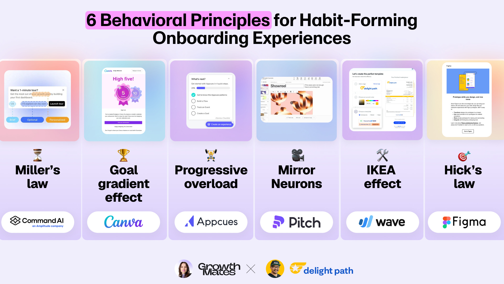
What we cover in this post:
Miller's Law: Breaking complex steps into manageable chunks
Goal Gradient Effect: Motivating users with visible progress
Progressive Overload: Building habits gradually
Mirror Neurons: Showing instead of telling
IKEA Effect: Building investment through customization
Hick's Law: Limiting choices to drive action
Let's dive into each principle 👇
Think about the last habit you tried to build. Maybe it was going to the gym every morning. Or drinking eight glasses of water daily. Or writing in your journal before bed.
Why do some of these habits stick while others fade away?
As Kate explored in her previous post, successful habit formation comes down to three elements from Dr. BJ Fogg's Behavior Model: having the motivation to do it, making it easy enough to accomplish, and getting prompted at the right time.
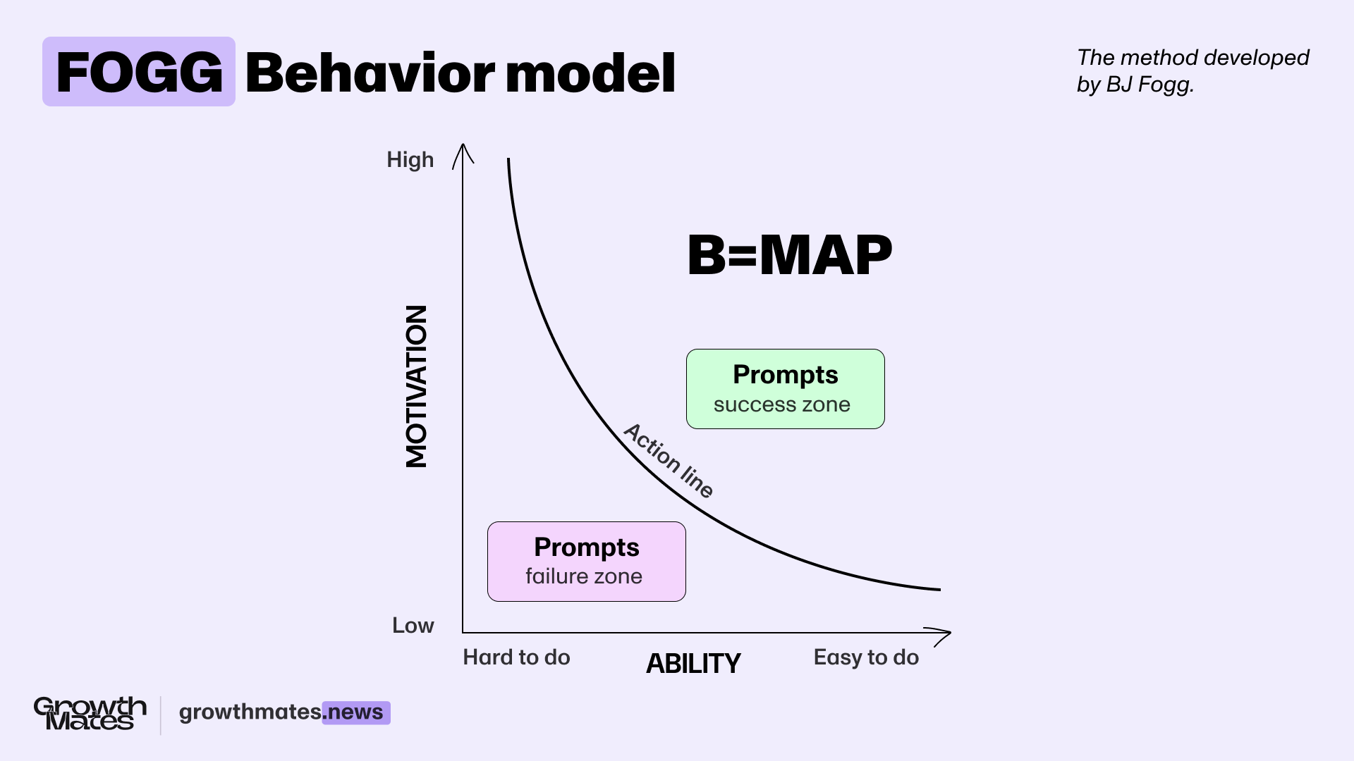
These same psychological principles determine whether users will adopt our products. Every new feature or workflow is essentially asking users to build new habits. By understanding and applying behavioral principles, we can make these changes feel natural and easy rather than overwhelming.
In this post, we’ll explore six behavioral principles to help your users adopt your product. We’ll also look at examples of in-product and email prompts that help users build lasting product habits. Let's start with one of the most fundamental principles: Miller's Law.
1. Miller's Law: Break Down Complex Steps.
Miller’s Law says that the average person can only hold about 7 (plus or minus 2) items in their working memory at a time. Beyond that, our ability to understand and remember new information drops dramatically. We've all experienced this cognitive overload, like when someone rattles off a long list of instructions, and we can barely remember the first few steps.
⏳How to Apply Miller’s Law
Break complex onboarding processes into focused phases of 5-7 steps maximum. According to Chameleon's 2025 Product Benchmark Report, tours exceeding five steps see completion rates drop by more than half. The solution? Break your tours into snack-sized, modular segments. Instead of showing everything immediately, reveal new steps only after users complete their current phase. This helps maintain momentum while preventing cognitive overload.

👍 Example: CommandAI’s Progressive Tours
In a previous Growthmates post, James Evans (CEO of CommandAI, now part of Amplitude) shares how they used progressive overload in their product. New users see an option for a "1-minute tour" to build their first dashboard. The tour clearly shows it's just five steps with a progress indicator, and users always have the choice to explore on their own instead.
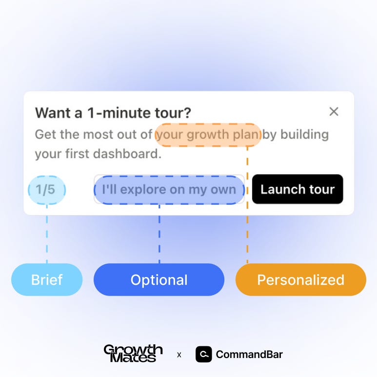
By focusing on one core workflow and personalizing the content, CommandBar helps users build confidence naturally. The short tour length and clear progress indicators reduce cognitive load, making the learning process feel effortless.
2. Goal Gradient Effect: Show Progress to Motivate.
The Goal Gradient Effect reveals that humans increase their effort as they reach a goal — like running faster toward the finish lines or studying harder before deadlines. For example, a research study found that café customers bought coffee more frequently as they approached their free drink reward.
Why? As we get closer to our goal, each action becomes more valuable. When you need 10 actions for a $10 reward, each step is worth $1. But with only 2 actions left, each one is worth $5 — driving us to work harder.
🏆 How to Apply the Goal Gradient Effect
You can significantly increase user engagement and completion rates by placing rewards and progress indicators (e.g., “50% completed”) along the user journey and showing clear progress toward them. The key is making each step feel achievable while keeping the ultimate reward compelling.
👍 Example: Canva's Success Email
Canva's onboarding perfectly demonstrates the Goal Gradient Effect through their milestone celebration emails. After creating your fifth design, they send a congratulatory email with a "High Five" badge. But instead of stopping there, they immediately show you what's next: a "10 Designs" badge waiting to be unlocked.

The email celebrates your achievement while teasing the next reward with a "Why stop here?" section showcasing new templates to explore. Combining immediate celebration and visible next steps creates a powerful motivational loop. Users feel accomplished about their current badge while being drawn toward the next reward, making each design feel like progress toward a bigger goal.
3. Progressive Overload: Start Small to Build Habits.
Athletes build strength by gradually increasing weights over time, not by attempting maximum lift on day one. The same principle applies to learning new software—users need to build confidence gradually rather than trying to master everything at once.
🏋️ How to Apply Progressive Overload
Focus users on mastering one core workflow before introducing additional complexity. Let them build confidence with basic features before revealing advanced capabilities. This creates a natural progression that keeps users engaged without overwhelming them.
👍 Example: Appcues Two-Phase Checklist
While at Appcues, our team discovered something fascinating about user behavior. When we showed users all onboarding tasks at once—installation, creating flows, tracking events, and setting goals—completion rates hovered around 2%. Many users felt overwhelmed and abandoned the process entirely.
So we experimented with breaking it down into two focused phases with increasing number of items:
Phase 1: Install the builder.
Phase 2: Three core actions (create a flow, track an event, create a goal)

The results? Checklist completion rates jumped to 58%, and activation rates increased by 25%. By applying Miller's Law, we made the onboarding feel manageable rather than overwhelming.
4. Mirror Neurons: Demonstrate Instead of Explaining.
Research by neuroscientists Giacomo Rizzolatti and Laila Craighero revealed that our brains contain "mirror neurons" that fire both when we perform an action and when we watch others perform the same action. That's why showing someone how to do something is more effective than explaining it in words.
🎥 How to Apply Mirror Neurons
Instead of writing long instructions, show users how to complete actions through short demonstrations. Quick visual guides, especially ones that users can immediately mimic, dramatically reduce the learning curve of new features.
👍 Example: Pitch's Onboarding GIFs
The Pitch team discovered that users struggled to understand how to customize their presentations through written instructions alone. Even with clear step-by-step guides, many users weren't confident making changes.
They transformed their onboarding by adding short, looping GIFs that showed:
How to edit slide layouts;
Ways to customize colors and fonts;
Steps to add animations.

These GIFs appear in both:
In-product guides;
Welcome emails introducing key workflows.
Users could watch a quick demonstration and immediately replicate the action, building confidence through direct imitation rather than abstract instructions. The visual guides turned complex features into simple, repeatable actions.
5. IKEA Effect: Let Users Customize to Build Investment.
People value what they help create. Despite its frustrations, the satisfaction of building IKEA furniture creates a stronger emotional connection than buying pre-assembled pieces. This same psychological principle can dramatically improve product adoption.
🛠️ How to Apply the IKEA Effect
Give users opportunities to customize and personalize your product early in their journey. When users invest time in making the product their own, they develop a stronger connection to it. The key is finding the right balance between customization and effort.
👍 Example: Wave's Brand Extraction
Wave, a financial platform for entrepreneurs, discovered a powerful way to tap into the IKEA Effect during user onboarding. When new users upload their company logo, Wave automatically extracts their brand colors and instantly shows a beautifully branded invoice.

As Vivek Balasubramanian, Wave's former VP of Product Growth, observed:
"During customer interviews, the customers we talked to that saw what their invoice would look like with Wave said, 'Wow! This is great! This looks professional. It's beautiful.' That gives them a lot of confidence that the product is good. Wave is something that they can trust."
This confidence-building moment helped users feel ownership over their branded invoice because they contributed to its creation, even though Wave did most of the heavy lifting. This small investment in customization creates an emotional connection that drives continued product usage.
6. Hick's Law: Limit Choices for New Users.
Hick's Law states that decision time increases with the number of choices available. The more options you present to users, the longer it takes them to make a decision—and they might not make one at all.
🎯 How to Apply Hick's Law
Focus each interaction on one clear action. Instead of showing everything your product can do at once, guide users through capabilities one at a time. This is especially crucial in onboarding emails where you're competing for attention.
👍 Example: Figma vs Grammarly Emails
Figma's onboarding emails exemplify Hick's Law perfectly. Each email focuses on teaching one concept with one clear call-to-action. For example, their onboarding email focuses on one key feature (in this example, prototyping) and call-to-action (“Go to Figma”).

Compare this to a typical Grammarly email that tries to do too much:
Multiple feature explanations;
Several different calls-to-action;
Various setup instructions.

While Grammarly offers valuable features and even effectively uses GIFs to demonstrate its tool (following our previous Mirror Neurons principle), combining everything in one email creates decision paralysis. Each section—especially that helpful GIF showing how to use Grammarly—could be its own focused email, gradually building user knowledge rather than overwhelming them with options.

The focused approach of Figma's emails helps users build confidence with each feature before moving on to the next. By limiting choices, they make it easier for users to take action and actually learn the product.
👉 Putting 6 Principles into Practice.
These behavioral principles provide a framework for creating onboarding experiences that feel natural and effortless. By understanding and working with human psychology rather than against it, we can help users build lasting product habits.
Remember these six principles to build habit-forming products:
Break complex processes into digestible steps (Miller’s law ⏳)
Show clear progress toward goals (Goal gradient effect 🏆)
Start with small wins (Progressive overload 🏋️)
Show instead of tell (Mirror Neurons 🎥)
Let users customize to build investment (IKEA effect 🛠️)
Limit initial choices (Hick’s law 🎯)
Want to learn more about building better onboarding experiences? Download the first chapter of my new book, "EUREKA: The Product Onboarding Playbook for B2B Products."

This is all for today, dear readers. If you found this helpful — please share your reaction and leave some comments 💜 It would give a huge support for me to continue creating this!
If you find this newsletter valuable, share it with a friend, and consider subscribing if you haven’t already. There are some discounts available, and maybe you can expense this :)
Connect with Ramli "RJ" John (thanks for sharing this post!) and me — Kate Syuma 🙌 Learn more about my work on Growthmates.club 👉
Keep growing!
Kate Syuma & Growthmates.
 |
|