10 Behavioural Principles and Dark Patterns in User Onboarding you need to know
Examples from Dropbox, Figma, Linear, and a deep-dive into Chapter II of "The Holistic Growth Playbook".
How often do you ask yourself: “What do our users need or care about?”. I’ll keep it simple: “What is good for the user is good for business”. I started reminding myself more often about this thesis when thinking about the advice I’m giving to companies, course materials, or practices I share here.
Before we start diving in, I wanted to share a couple of special announcements with all dear readers of Growthmates 👇
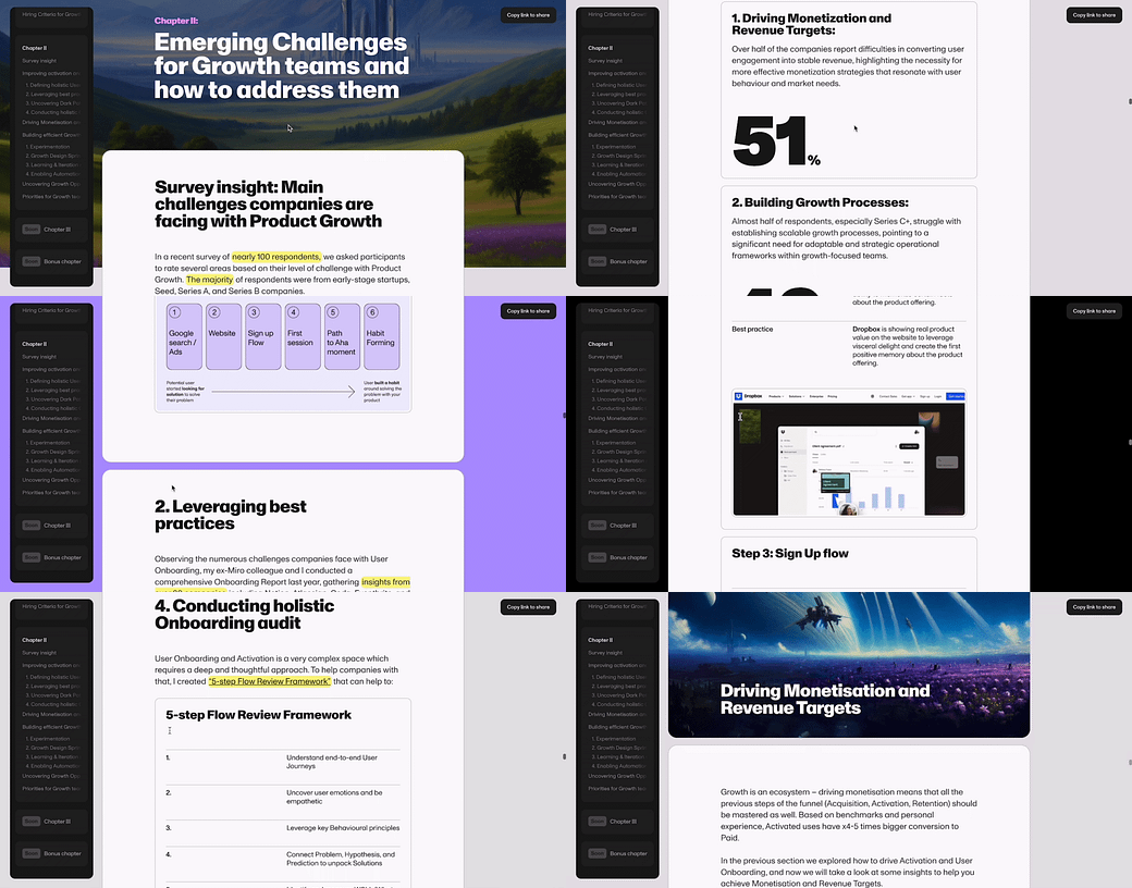
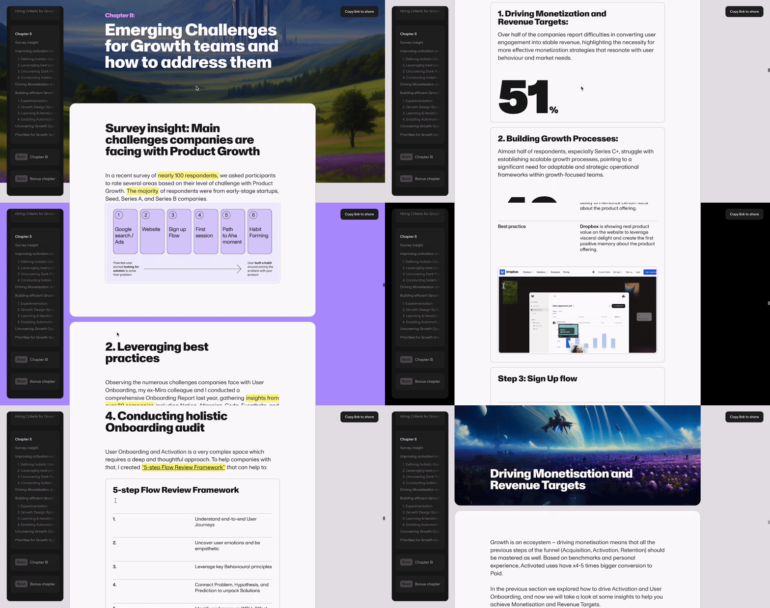
A couple of months ago I shared The Holistic Growth Playbook which aims to provide fresh perspectives and inspiration for anyone interested in Product-Led Growth (PLG) and building high-quality products with that approach. It includes frameworks and best practices drawn from Growthmates guests and leading Growth experts.
We already dove into Chapter I to explore How To Build high-performing Growth Teams, and today I’d like to introduce you to some insights from Chapter II.
What’s inside this post:
Main Challenges and Priorities (from surveying 100+ companies)
6 steps of Holistic User Onboarding
Uncovering Dark Patterns and Behavioural Principles
Where to get more inspiration
The main Challenges and Priorities for Growth Teams
Why do we need to talk about Behavioural psychology and how it’s even connected to Product Growth? And why do we need to start applying them on User Onboarding in the first place?
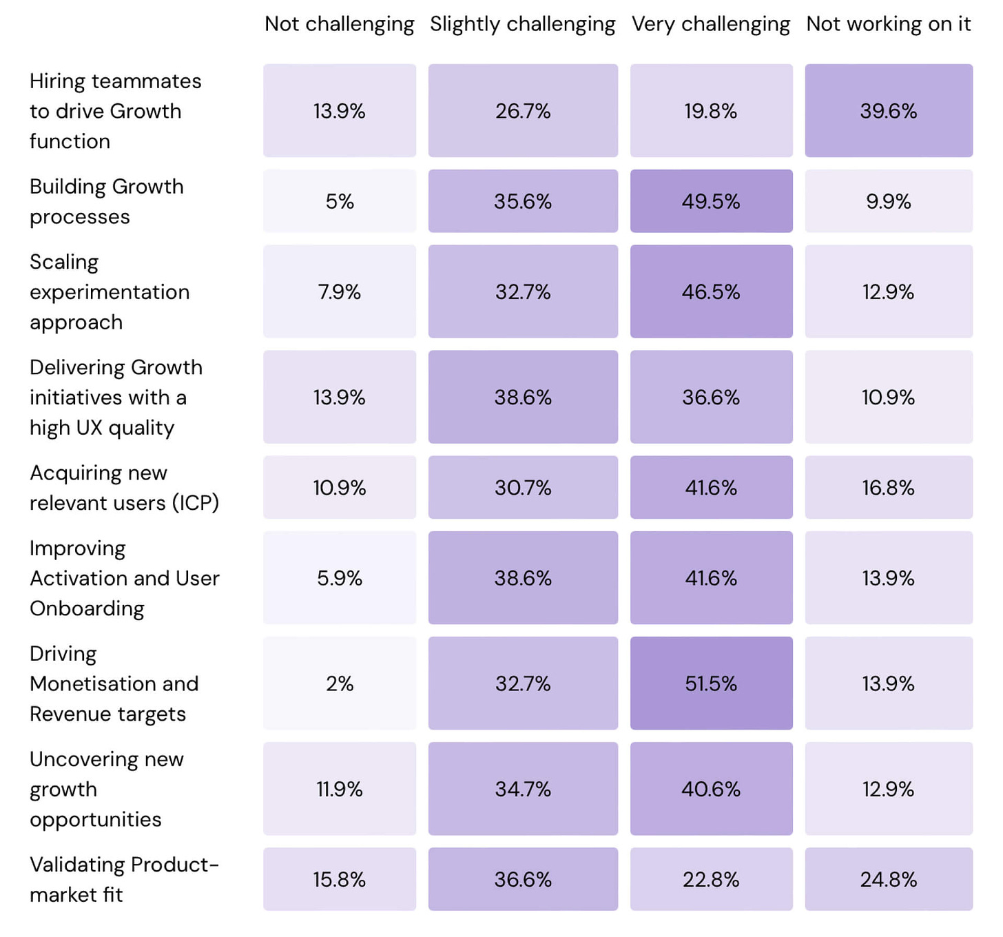
To make this playbook more user-centric and informed by real insights, I ran a survey and collected responses from 100+ respondents coming from early-stage startups, Seed, Series A, and Series B companies. I asked participants to rate several areas based on their level of challenge with Product Growth.
Here are the Top challenges companies are facing with Product Growth (rated as “Very challenging”):
I wasn’t very surprised to uncover that the majority of participants selected these 5 areas as “Very Challenging”. It mostly confirmed my initial assumptions:
Driving Monetization and Revenue Targets (51%)
Building Growth Processes (49%)
Scaling Experimentation Approach (47,9%)
Improving Activation and User Onboarding (42,7%)
Acquiring New Relevant Users (41,7%).
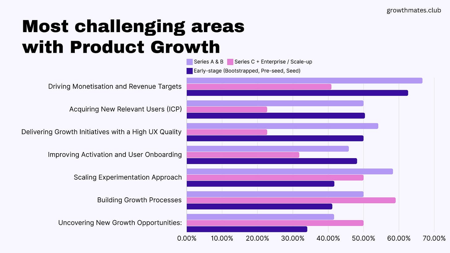
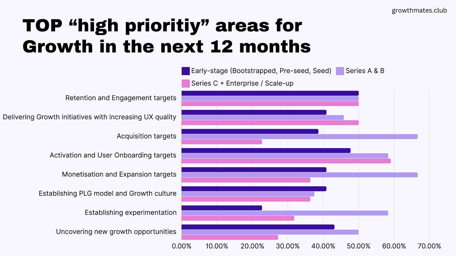
I decided to dive deeper and see if there were any patterns based on different segments of participants and compare if there are any connections between “Main Challenges” and “Top Priorities” that companies outlined.
Looking at these two graphics above, the conclusions that I made:
Companies are intentional about delivering growth initiatives with increasing UX quality (44,8% on average mentioned it’s as a “High priority“)
Together with that, companies are struggling with driving Monetisation, Activation, and Acquisition targets (all of them are in TOP-5 challenges).
It made me think more that there’s a gap in the actual understanding of the user behaviors to be able to drive these targets on all steps of the funnel.
As in a natural user journey when everything starts from the first user experience with the product, I decided to start addressing these challenges in the playbook from defining the holistic User Onboarding and providing some best practices to move the needle.
Let’s look at some of them 👇
Defining holistic User Onboarding
This is the first and the last thing most users see before they leave. But User Onboarding ≠ First session. We need to think of that holistically.
Almost 43% highlighted that “Improving Activation and User Onboarding” is “VERY challenging” 🤯. I can’t agree more — the Activation metric is stubborn. Onboarding starts way earlier than we used to think, and last way longer.
Several respondents also mentioned that defining and validating Activation became a milestone for building a Growth function. Activation and User Onboarding form the foundation for overall Product Growth.
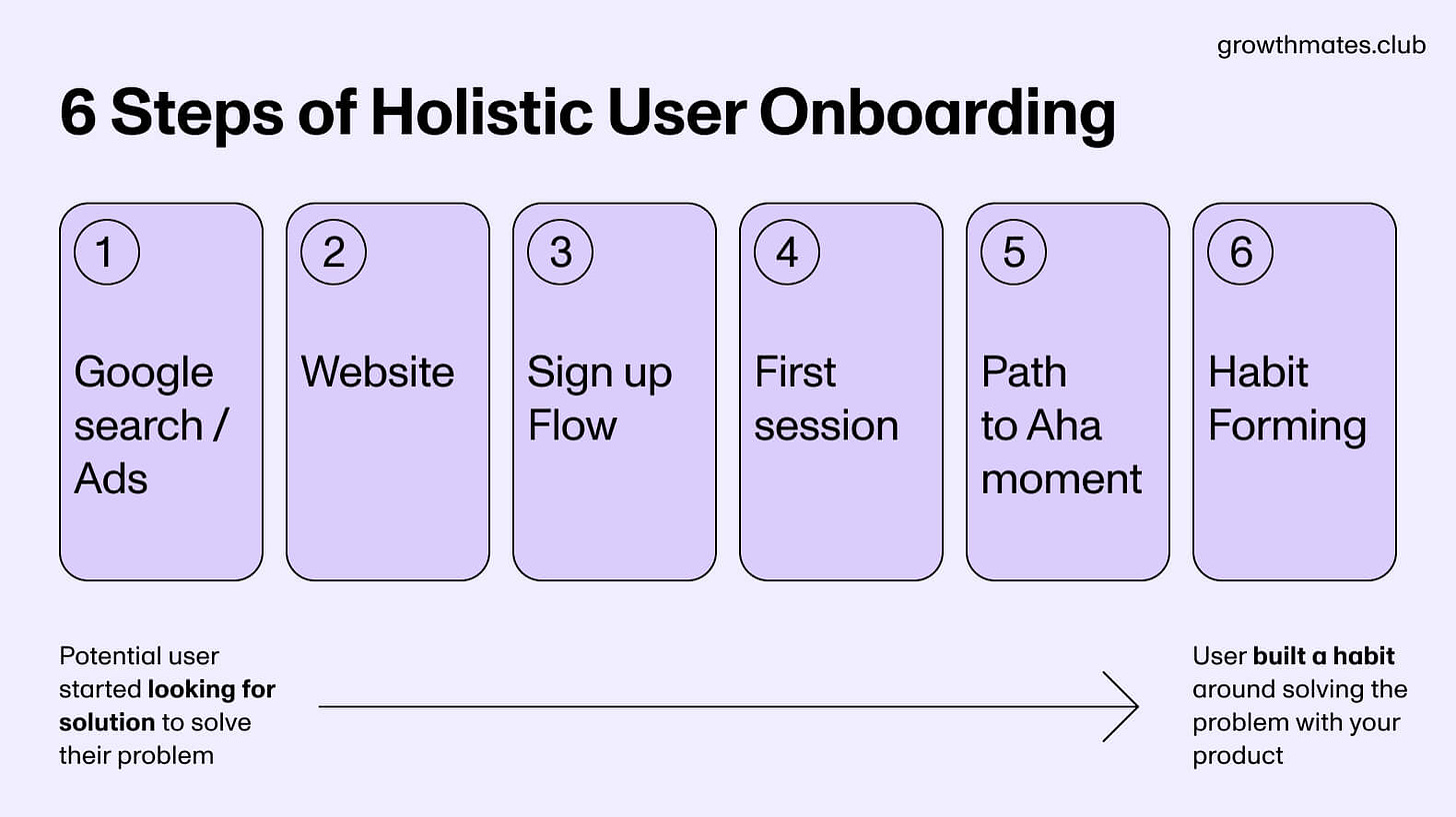
As users begin their first experience with the product, they build initial trust, setting the stage for long-term engagement and success. Here are 6 major steps of Holistic User Onboarding:
Google Search / Ads → Potential user started looking for solutions. This is where your onboarding starts.
Website → Potential user (visitor) is exploring the possibilities of the product, looking for the value and differentiators to decide to sign up.
Sign Up Flow → The user performs the necessary actions to set up the core value of the product (creating the profile, providing profiling information, etc.). It’s also often connected to the “Setup moment”.
First Session → The user interacted with the product for the first time.
Path to Aha moment → The user has experienced the core value of the product for the first time.
Habit Forming → The user has established the habit around the core value of the product.
To help you navigate across all of them, let’s walk through each of the steps and unpack dark patterns to avoid and behavioral principles you can apply to address them.
Step 1: Product Search / Ads
🔴 Dark pattern: “Banner blindness”.
Users are used to ads and know the places where they can see this distraction. They tend to avoid even looking at those areas (top and bottom corners), or immediately close something that appears unexpectedly.
You’ve probably seen many times annoying popups with the button “Subscribe / Register” that appear unexpectedly from different parts of the website. I don’t even have an example to show as I turned “Ads Blcok” on all websites 🙃
Step 2: Website
🟢 Behavioural principle: “Short-term memory”.
Users have lower motivation and ability to memorize certain facts about the product offering.
👍 Best practice
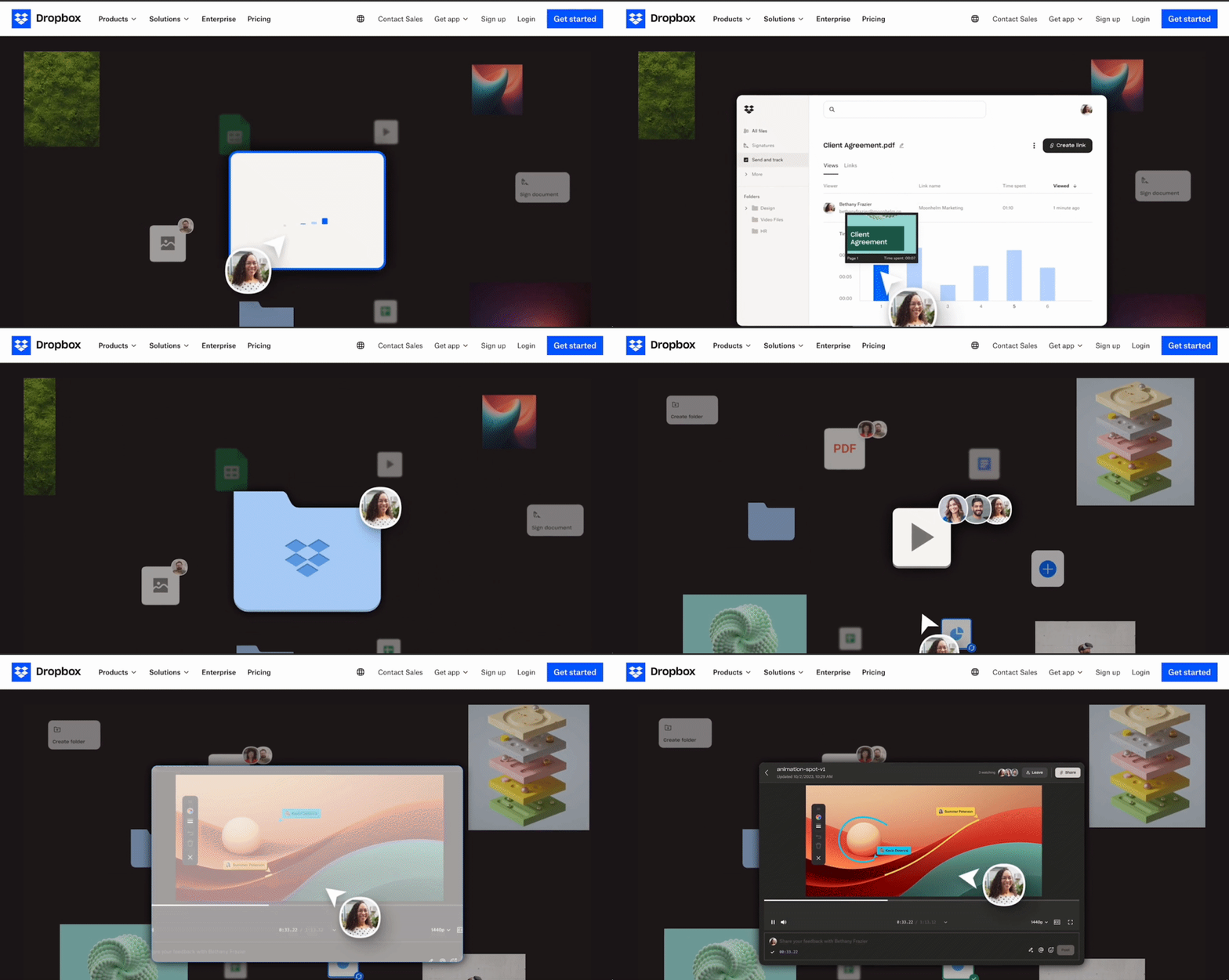
Dropbox shows real product value on the website homepage right after the main screen to leverage visceral delight and create the first positive memory about the product offering.
🟢 Behavioural principle: “Visceral Delight”.
There are 3 pillars of delight and you can deliver it “viscerally, behaviorally, and reflectively” — so think if there's such a peak moment your new user truly experienced with your product. Studies show that "aesthetics and visual design play a role in positive perception and delight." For B2B SaaS it's important to show the product value intuitively clear way, showing the product interface and examples of use cases.
👍 Best practice
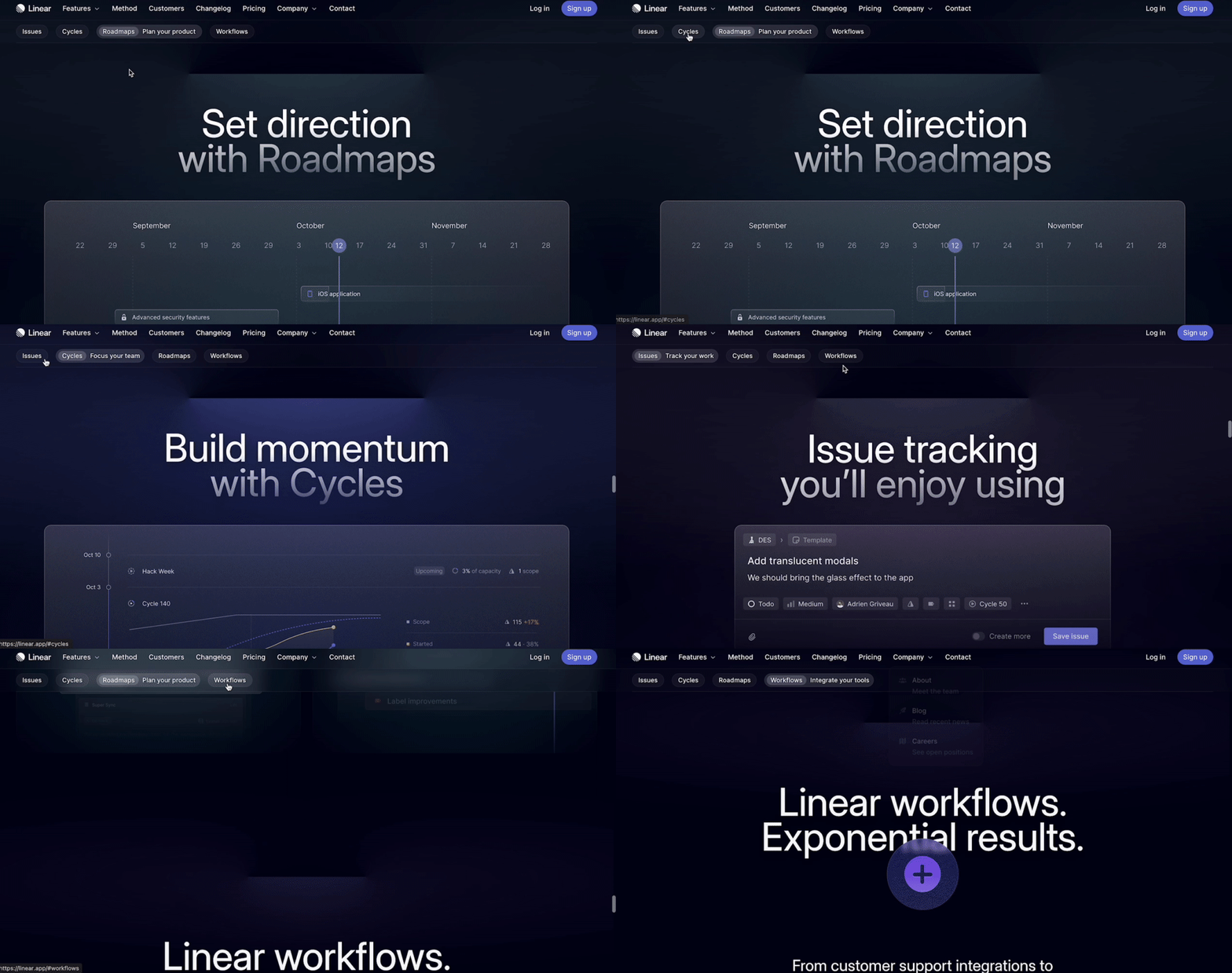
Linear is doing a great job of showcasing product use cases visually and intuitively on the product website. It also helps to:
Create better familiarity with the product
Memorize main use cases from the very beginning
Discover these use cases in the product faster
Step 3: Website
🔴 Dark pattern: Exceeding the “Miller’s Law”.
Miller’s Law says that the average person can only hold about 7 (plus or minus 2) items in their working memory at a time.
🟢 Behavioural principle: “Interaction cost”.
Design this 3-9 questions sign-up flow by applying to minimize unnecessary interaction (reading, scrolling, clicking, typing, page loading).
👍 Best practice
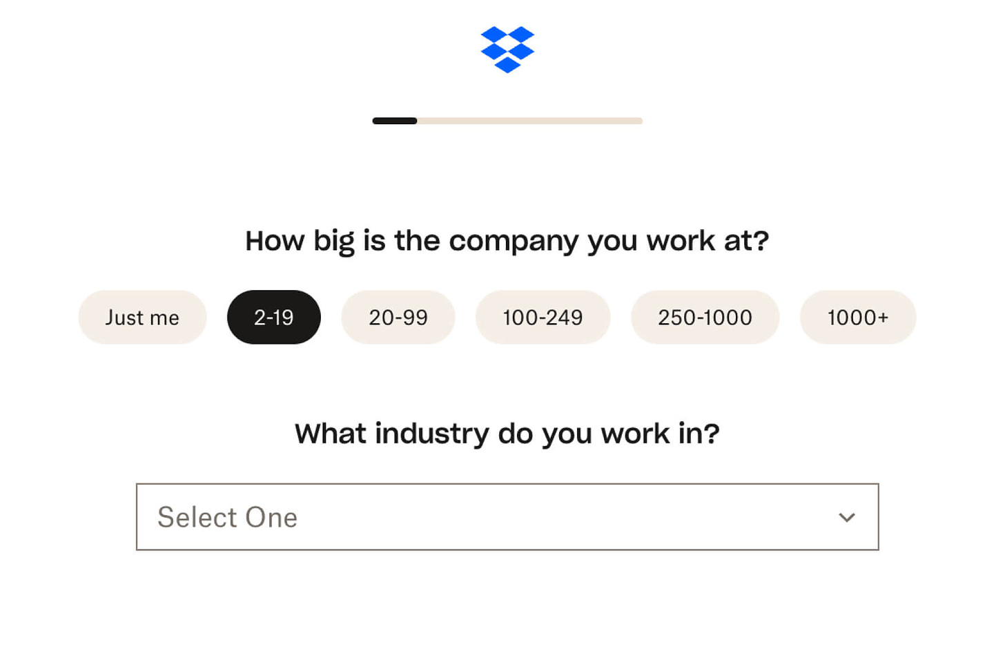
Dropbox is showing a sense of progress and progressive disclosure of questions.
Step 4: First session
🔴 Dark pattern: Creating a lot of “Cognitive load“.
The amount of cognitive effort that is required to complete a task in the onboarding process. For example, the “Invitation” experience is often designed in a way that requires a lot of cognitive effort, and we can simplify it in the first experience. Now we can also leverage AI to make some tasks less effortful.
🟢 Behavioural principle: “Hick’s law”.
The time it takes to make a decision increases logarithmically with the number of choices available. In other words, as the number of options increases, the decision-making time also increases. Keeping a limited number of choices is a good behavioral principle.
👍 Best practice
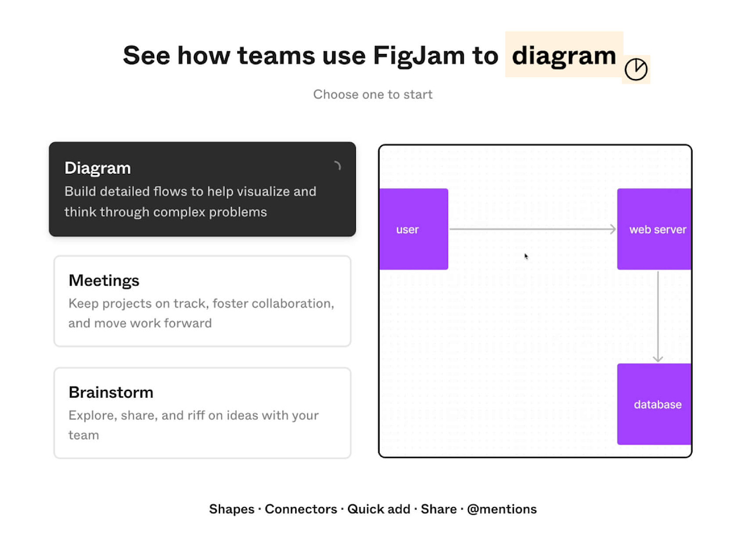
FigJam is limiting the number of choices to the magic number 3. The user has to choose one of 3 main use cases to start from: Diagram, Meetings or Brainstorming.
Step 5: Path to Aha-moment
🔴 Dark pattern: “Bombarding notifications”.
The majority of complex B2B SaaS (and not only) faced this problem while designing external triggers as notifications to drive Activation. The rule of thumb is to show one notification at a time and drive one action at a time.
🟢 Behavioural principle: “IKEA Effect”.
The “IKEA effect” is a behavioral principle that refers to the tendency of individuals to place a higher value on products or projects that they have personally invested time, effort, and labor into creating or assembling.
👍 Best practice
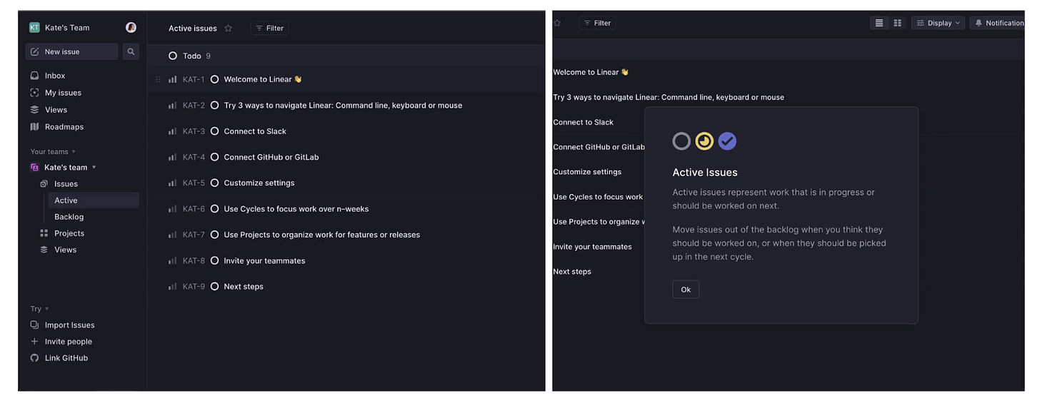
Linear is encouraging users to start performing work-related tasks starting from the first session in the product. By performing each action, the user becomes closer to Aha-moment and Activation. But the user is not left alone completely — while performing new actions there’s a helpful explanation that appears at the right time (like this popup explaining “Active Issues”).
Step 6: Habit Forming
🔴 Dark pattern: Overusing “FOMO” to unnatural habit usage.
Each habit-forming process should rely on natural frequency to drive usage. For example, B2B products like Amplitude have lower natural frequency (e.g. once a month) for stakeholders who are only checking certain dashboards. On the other side, B2C products and learning apps can have daily and weekly natural frequencies.
🟢 Behavioural principle: “Hooked Model“.
The Hooked Model was introduced by Nir Eyal and quickly became a go-to framework for Growth Product practitioners. The definition from Nir: “The Hooked Model is a way of describing a user’s interactions with a product as they pass through four phases: a trigger to begin using the product, an action to satisfy the trigger, a variable reward for the action, and some type of investment that, ultimately, makes the product more valuable to the user. As the user goes through these phases, he builds habits in the process.”
👍 Best practice
Grammarly is showing premium suggestions as a “Variable reward = core value” that stimulates users to continue investing time into using the extension to build a natural habit of premium suggestions and potentially convert to paid. If we decompose the whole framework, in Grammarly it looks like this:
• Trigger (internal): as a user, I want to sound more professional.
• Action: I write an email to my client.
• Variable Reward: Grammarly gives premium suggestions.
• Investment: I continue using Grammarly.
Conducting holistic Onboarding audit
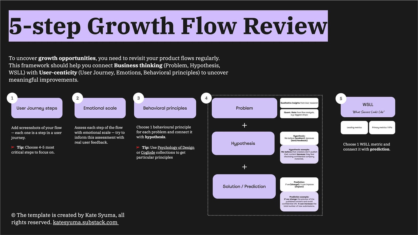
User Onboarding and Activation is a very complex space that requires a deep and thoughtful approach. To help companies with that, I created “5-step Flow Review Framework” that can help to:
Understand end-to-end User Journeys
Uncover user emotions and be empathetic
Leverage key Behavioural principles
Connect Problem, Hypothesis, and Prediction to Unpack Solutions
Identify and measure WSLL (What Success Looks Like)
P.S. Did you know that I’m also helping companies by conducting an Onboarding Audit to uncover growth opportunities and UX improvements? Book an intro call with me, and I’d be happy to discuss your challenge and explore how I can help
🎁 Bonus: Resources on Onboarding and UX
The Ultimate Guide to Onboarding from
The evolution of Miro's user onboarding by
on Growth UnhingedFrom Old to New Ways: 6 Methods to Drive Activation and Adoption with CommandBar
What is a good activation rate by
andTry this onboarding email series strategy… it actually works! by
Access Report: The State of Product Onboarding (2023) by
and on ProductifyPsychology of Design by Growth.design
Coglode collection
How Superhuman Grows and more from
3 pillars of Delight by NNG
This is all for today, dear readers. If you found this helpful — please share this with your like-minded colleagues and friends, it would give a huge support for me to continue creating this 💜
Connect with me on LinkedIn and learn more about my work on Growthmates.club.
With best regards,
Kate Syuma





This is an awesome guide! Bookmarking this to use as a reference going forward 😊